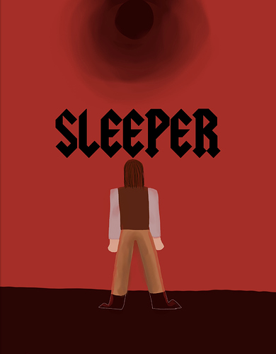
So this is my comic’s current cover, but something about it just doesn’t click with me. It’s weird because it’s really close to the cover I’ve had in mind for a long time, but now that I see it in real life, there’s just something... off about it, if you know what I mean. Does anyone have any design tips on how I can improve this?
I think what's lacking is contrast and clarity; Not in the sense of understanding what the figures are but more in what's going on. Is he looking up at the sky or up from the bottom of a hole?
He’s looking up at the sky. And that makes sense. It is pretty vague now that I take a closer look at it. Do you think a different angle, maybe one where the viewer can see his face, would help?
Does it matter if they see his face? While faces draw more attention, do you really need it in this case?
I’m. Actually not sure. I mean, I want people to be drawn to the cover, and if a face helps with that, then I guess I would? But now that you ask, I don’t know.
Well the story is mostly going to take place in hell, right? That can be a focus then. I think a darkened silhouette of a guy looking up a hellscape to unfortunately see a darkened sun and despair all around him would be very interesting.
Hmm okay. So not too big a change from what I already have, then? I still think I’ll need to change the perspective a bit so it’s easier to see that he’s looking up at the sky, and then add some elements of hell into the background and the space around him like you said.
If you add clouds then it could be easier. Would you mind if I made a few compositions for you to reference?
No, not at all, go ahead!
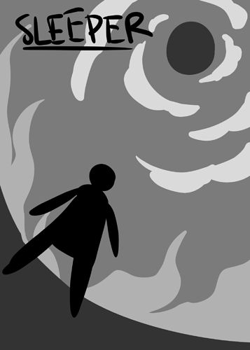
Cool, I'll do them in greyscale so you can understand the values
Here's one idea I had:
Ooh, I like the angle the camera’s at. And you’re right, the clouds do help portray the fact that he’s looking at the sky.
I'd say you nee dto workon colors or their velues - because it's all relatively red and his boots blends with the ground. you can tweak hue parameter a bit or ad some cool tone like purle in the shadows.
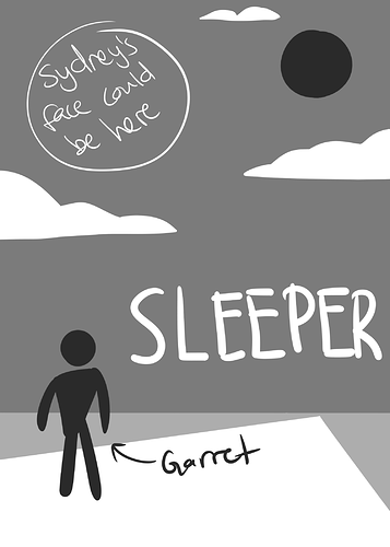
Thanks! Here's the next one:
Thanks for the feedback! I agree that it needs some more color variation: I think adding the purple like you said will really help with that.
This one isn't as interesting but, if you want a face. . .
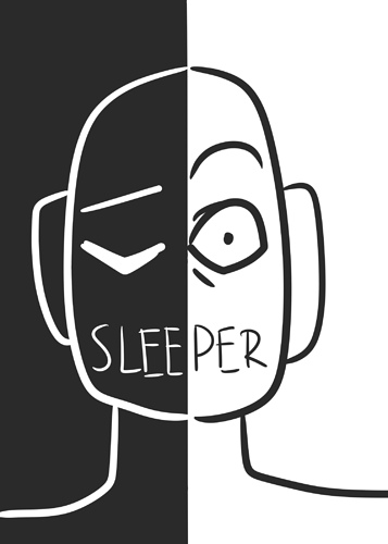
I like this one too! I wanna see what your last idea is, but so far what I think I’m gonna do is see if I can find a way to combine this one and the first one.
I think I already did that for you , but I think it could be refined.
Cool! Thanks for all the ideas! I’ll redraw the cover and then post it here so you can critique it again if that’s okay.
Great! Happy to help!