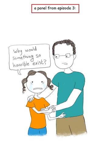
Great work! If it was me, at the rate you're improving I'd just keep doing whatever you're doing for now because it's obviously working for you. Your lines look way more confident so quickly and you have a sweet, clear and distinctive style.
A small thing that would make everything feel more cohesive/professional is picking a slightly softer color for your text - closer to (or matching) the color of the border on your speech bubble and your line work.
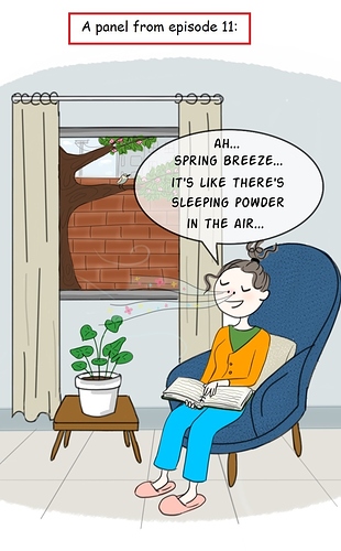
If I can think of any constructive art criticism it's the textures - like in the chair, the airbrushing in the bricks, the snow on the window, etc. were ever so slightly distracting for me. I think it's that your shapes and lines feel very clean to me, so I'm looking for clean flats or more cohesive textures throughout. That though is a matter of my personal taste :).
Keep it up!! <3
Edit: a tip also - if you're promoting at all and/or would like people on the forum to be able to easily check out your comic or socials, you should pop links into your forum profile summary ;D.