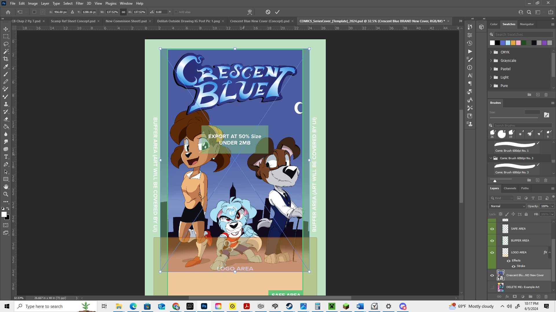
So if you guys didnt know, Tapas updated their new guidelines for covers so that part of it is cut off the bottom part is faded out: https://www.creators.tapas.io/new-cover-guidelines-2024
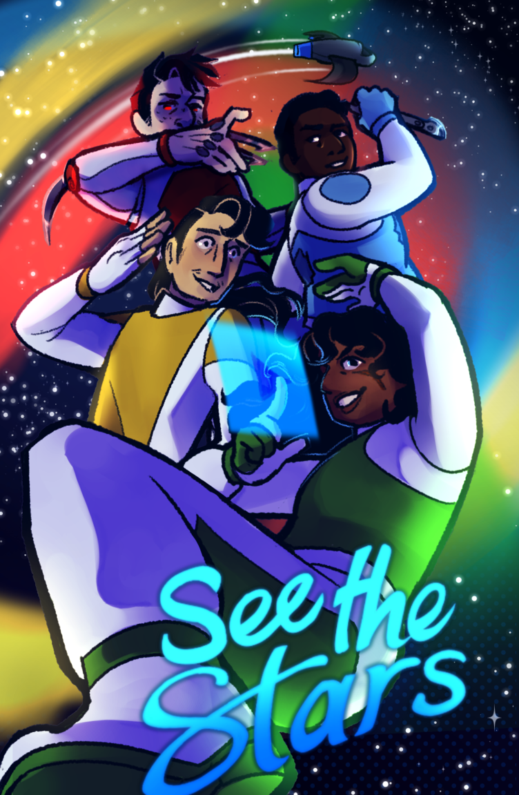
Im not going to sugar coat how I feel about this. I hate it. In fact, I absolutely despise this change. I had just updated my cover a few months ago to better fit the image dimensions tapas required since my older one didnt. Plus I thought it would be more inviting to readers, and now all of that's been invalidated pretty much. 
Personal grievances aside, I don't understand why they made this change. The old layout of the site was fine, and it unintentionally feels like a slap in the face to creators who use the site. With the only benefit from this being that it'll help better promote your series (which again, feels like a spit in the face to me because that's what I wanted to do with my current cover), so I guess regardless of how anyone feels, we're all going to need to adapt......or silently protest hoping they're rollback this change like what Im currently doing.
What do you guys think?