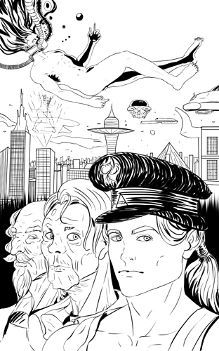
I want some feedback of that style I am using currently hope you would say something about that to me. Something you like it or I could change in this
I think it looks good. I suggest varying line weights, for instance making stuff in the foreground have thicker lines, just to help convey depth. In the first image things get a little muddled together since the lines are the same width.
Thank you very much for the comment. Great point about the lines volume. I will keep that in mind in the next illustrations. I am thinking to apply some like that in a press comic book and while I like that style I am not sure about people perception.
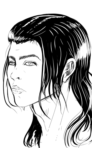
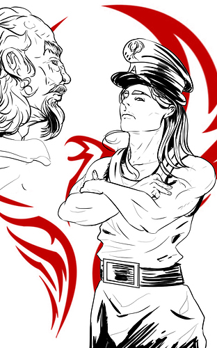
Some other examples.
I really like it, the later ones especially, I feel like the lighter value in the later examples gives a really nice soft look.