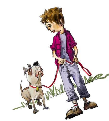
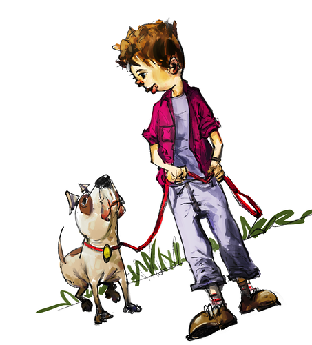
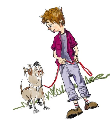
Tricky one because the differences are subtle, but I think A has the nicest sort of balance of levels and saturation to me. B looks a little over-saturated and garish, and to me the lurid digital colours aren't quite matching the natural feel of the inks and rendering, which I think feel much more at home with more watercolour or marker-like colours like A and C. I'm not feeling C because it looks unfinished. I quite like the delicacy of rendering on the kid's face, but in other areas it just feels a bit "bare", like it could use a little more rendering like A.