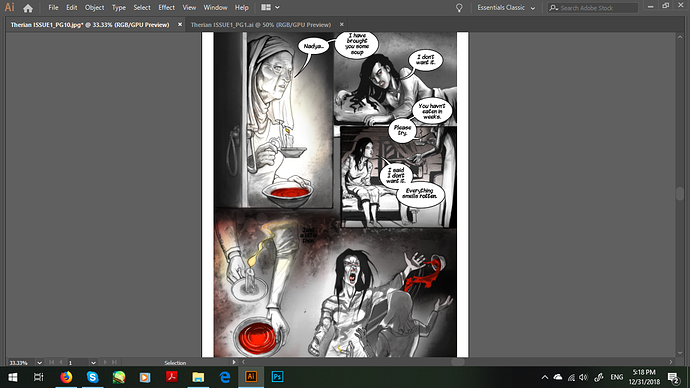
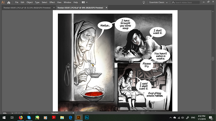
i dont think this lettering is cluttered - youve got good flow and things are clear with plenty of breathing room. this is a really nice page. the rule of thumb ive heard is no more than 20 speech bubbles per page, and no more than 20 words per bubble.
that said - youve got this beautiful shaded art, and these very digital and un-stylised vector bubbles that clash with the style and feel unprofessional. id recommend getting rid of the black outlines, maybe even try hand drawing some bubbles, its as easy as a couple blobs from a textured brush, and means you can make bubbles that fit your text better.