Dude I am in awe at the amount of time and energy you put into this critique. Two thumbs up from me, and I agree with everything you said, especially about the bright, clashing colors.
I would like to add that OP's shading is unrealistic- they just kind of darken the edges of objects, and don't really seem to pay attention to where a the light source is. The lighting is also very soft, and looks the same in all the colored paintings. They could also stand to use some subtle contrasting hues in their shading instead of using darker versions of the base color.
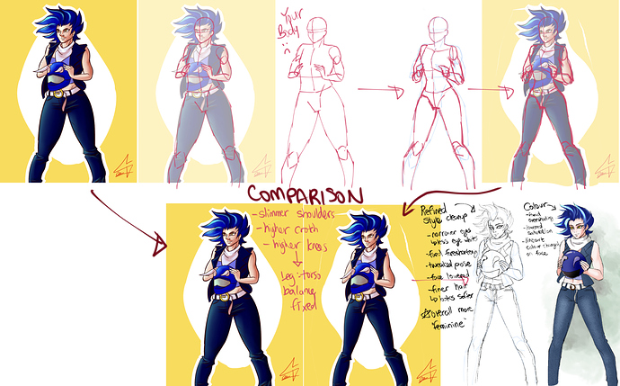
Also, the posing is almost exactly the same in all the drawings: Straight on, 3/4 view, upright posture in all drawings. It all looks very stiff. Maybe try drawing people in different poses: slouching, twisted around, from above or below, from behind and with foreshortening.
Some good things I noticed:
The paintings all avoid same-face very well. All the characters look like individual people, and not like a face template the artist has memorized, which is a very common problem I see even in artists with very good technical skills.
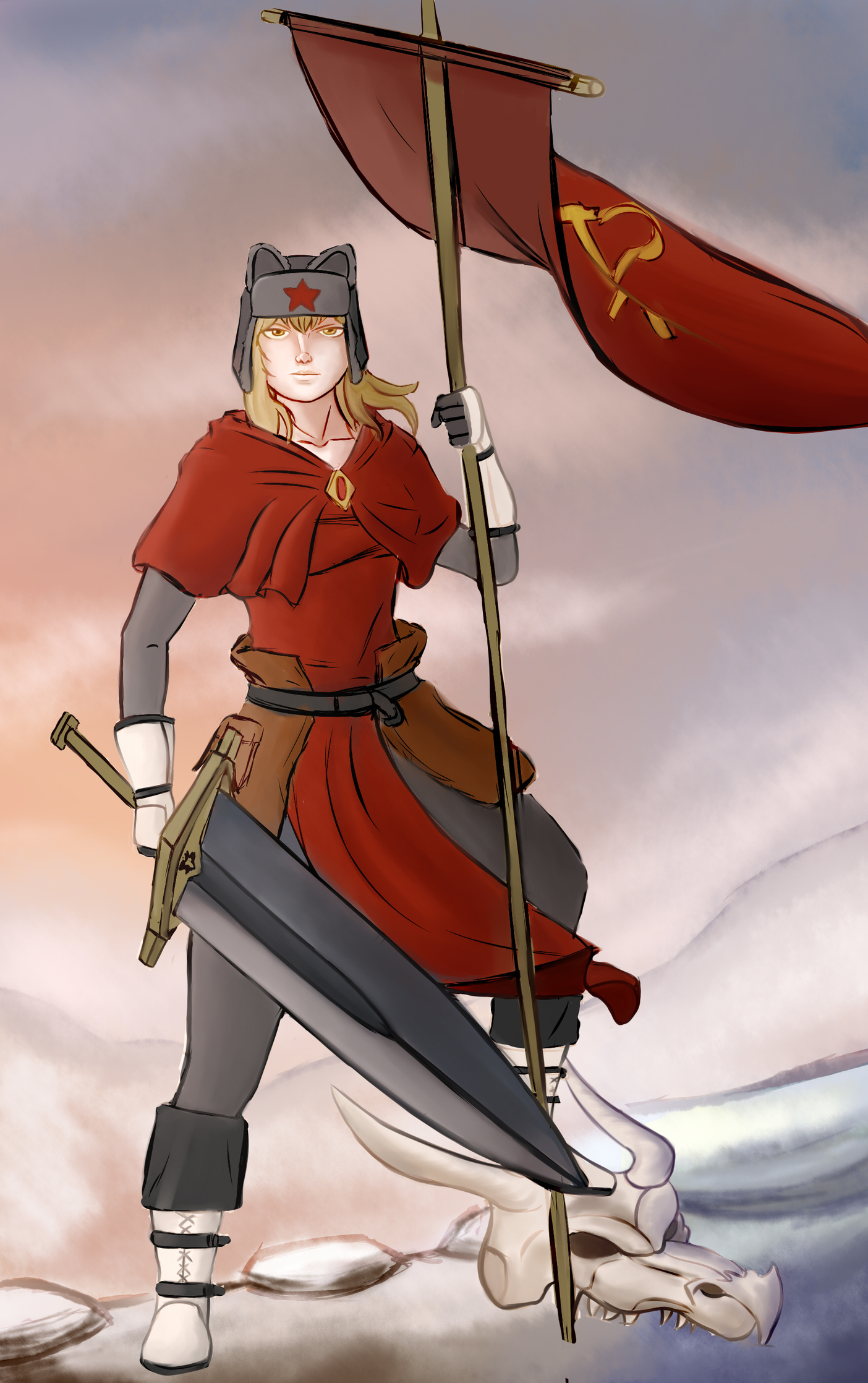
The last drawing has much better colors than the others. The subtler colors and the contrasting red and blues make the painting seem like there was just more thought put into the color choices than in the other two.
I actually think Kimoisempai's edit of this piece looks a bit worse than the original for this reason. The dark shading and the bright green they added mess with pastel, limited color scheme of the original, and destroy that flat, traditional Japanese artwork look I think the original author was going for.