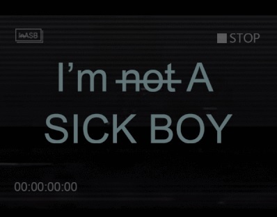
Fonts is my least fave thing so I just go simple - can't be more simple than Arial Font XD
The strikethrough on the not is probably the only thing that gives it something extra, meant to be left open to the viewer too, either they are or aren't Sick Boys (for starters, they are asymptomatic carriers but are dubbed sick boys in the comic, sick girls aren't sick boys, also the psychological, derogatory aspects).
Guess I was trying to capture something easy to read, contemporary, camcorder-ish, serious looking and obscure.
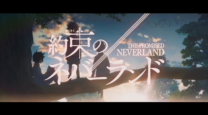
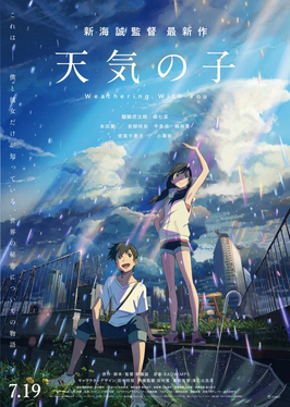
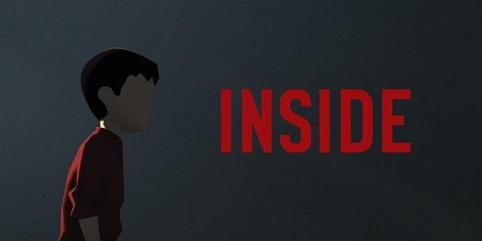
And was inspired by the aesthetic of darker games and films like some of my faves below: