
Frogsnack
Frogsnack
- Joined
- Jul 21, '16
- Last Post
- Sep 11, '23
- Seen
- Sep 25, '23
- Views
- 13
- Trust Level
- basic user
Subbed to your story- like your cover art. @PenguinAngel- subbed to your comic, the design is very ambitious and I love that you will be introducing several characters. [image] Here is Scholar for those who can sub back;
You hit the nail on the head there for me. The 'woodenness' of the outline. Like a quick sketch feels more alive than a study of a still form. Maybe that's what I feel about outlines.
I try to plan out the 'keyframes' if you will. I can't outline too much if I've not drawn the characters in their setting already, because the way they are drawn out tells me more about them. I have failed in creating characters many times because I've tried to outline them first, but if they don't …
I love this idea as curated lists are BORING. I will be reading things I subscribe to here. Comments are also appreciated on SCHOLAR, which is pencil, ink, tones, occasionally copics. I'll sub back. New page this Fri.
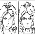
Her off-focus and intense expression makes me want to see what she's seeing- this could be used as part of a title page, even.
Doesn't Irk me, but I'd say unless the title include that style as a feature (like '8 Bit Stories' or something) people may misunderstand that it's chosen on purpose, and not resized incorrectly.
I think if you layer them both- the cell shaded over the top as depth you'll the more serious, somber tone that you may be looking for. However you could easily grab one penal from the sepia tone on the left to make one part more impactful- that way you could choose which panel to highlight as the m…