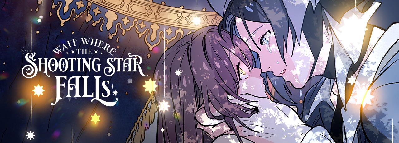
Just something I thought was worth bringing up. One big problem a lot of people have with scroll comics is that the panels just stacked on top of each other can get a little boring at times. There are some good things like big panoramic shots or using gradients to transition but unfortunately it’s usually a lot of boxes in white space. That’s why it feels so refreshing to to read “Wait Where the Shooting Falls!”
If you like fairytales you’d like this one! The one thing I thinks separates it from most scroll comics (or at least a lot of Korean ones) is that it’s really good at transitioning from scene to scene. Instead of relying on only gradients, it actually uses its environments: it’ll transition with a curtain here, a wall there, it might use someone’s hair in one panel and transition with the rocks on the ground in the next. It’s “spoilers” if you care about that sort of thing, but I think this episode is a good example.
https://m.tapas.io/episode/2184344
It makes sense that a lot of scroll Webtoons don’t do this since so many of them (understandably) rely on 3D backgrounds. This comic even gets around that “big, white space” issue by using beige, manuscript textures for the background. It really adds to the “storybook texture” of the story. It’s a paid story so many of the chapters are locked, but if you like fairytales and you get a little tired of how “clean” a lot of Webtoons look I think you’d like this one!