When I look for comics 90% of the reason I check one out is because the icon / thumbnail looks KICKASS.
Which made me look at mine. While they're not bad, I think I could make them MORE KICKASS.
I'll post mine, in an effort to get feedback ideas, but feel free to post yours too! I"m down to offer advice. Let's all be icon informatives xD
^This is the one for my series "Evil Villain Academy"
I originally thought it was perfect since it's shows the series extreme cartoonyness, and her with the notepad shows part of the theme to the story. School.
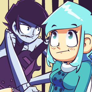
^This is for my other comic, Max Parrish.
I made this last year, althought the actual drawings of the characters were made in 2012!
So I REALLY want to update this one and make it better.
^I just made this. Even the drawing is recent (and admittedly I think it's the best one I've made of this character)
but I"m not so sure it pops out, or even is all that perfect/representative of the series.
BUT, if it gets me those sweet delicious subs I don't care that's all I"m after. That's all anyones after amiright
xD