Let's see the comments you gave me.
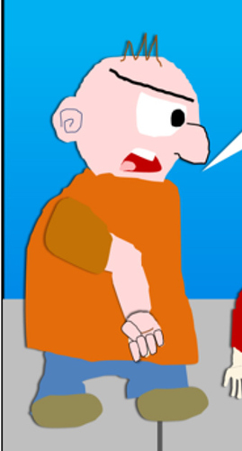
@Kelheor - Wow! The art style's that bad, huh? I should've asked for opinions about my art style before launching my comic. I'll come up with a new one that's more pleasing to the eyes (doing my comic over again), but it will take several days. I agree with you on the anatomy, though. Yeesh! It's not easy working with MS Office PowerPoint for creating and moving body parts (and talk about trying to have it be uploaded yesterday). I'll look down at the advice and picture RealDualDragons gave me. As for the three banners thing, my point was to mimic Cinemassacre's approach to uploading videos because I like James Rolfe's role model. But I see your point with them being unnecessary, because people can look on the left-hand sidebar and see the upload date. I should've put "First Published" instead of "Originally Published". Oops. But that's fine; 2 of the banners have been removed and only left [at least] the episode name intact.
I wanted a brand for my web-comic holding site that can be recognizable as Twitter or Facebook. I wondered if my comic site's popular enough, it can turned to an empire and I could remove the "online" portion of the logo. I'll take the "Online" portion of the logo out, but the domain will still have that word.
Thanks for the constructive criticism! Now, I know I'll need more work before the Tapas Christmas Party!
@realdualdragons - Thanks for pointing out the anatomy. Once again, Yeesh! That looks friggin' awful! I need to learn how to move some parts properly. I'll follow your advice on studying the anatomy of characters.
I'll take all your comments into consideration. Thanks for commenting.