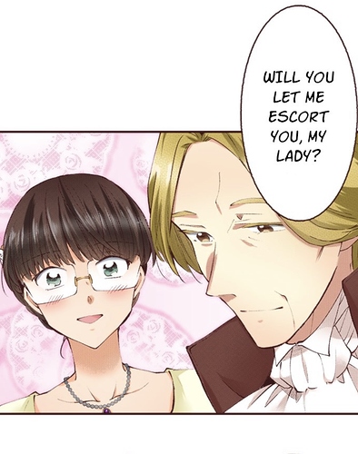
I’m a firm believer of only using background when you absolutely need to! But I’ve also noticed if you’re going to go sans backgrounds you probably should put something there to make it a little bit interesting like a gradient for example. So I’ve been sort of re-reading some shoujo manga and I noticed one of the ways they make background-less panels look good is just by adding a lot of fluffy little screen tone patterns like these.
I noticed there are a few brushes that help but I wanted to know if anyone had any other suggestions on places them well? Investors seen a few in the asset store but I’m a little lost on how to use those even. Any suggestions would be appreciated.