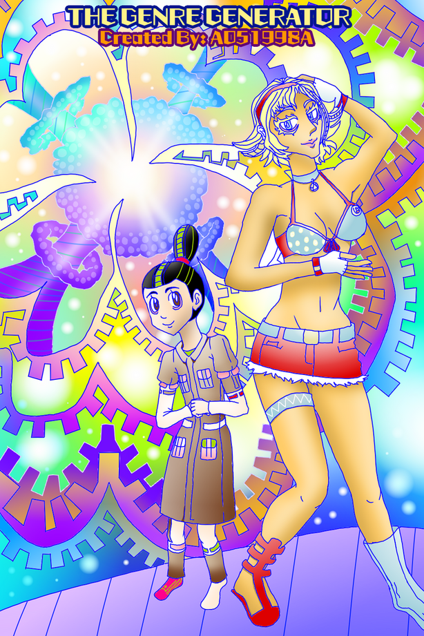
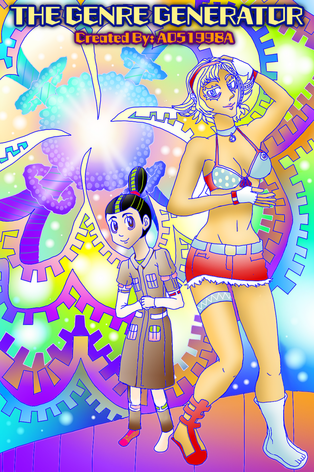
The smaller girl has some anatomy errors, especially her legs. With the length of her coat, her knee bend would be above the hemline - knees are roughly halfway up the leg.
Otherwise, the background colors could contrast more with the foreground figures to help them stand out more - lighten one and darken the other. Also, make your title larger so that people can read it when it's 1.5" tall.
Good work, keep it up!