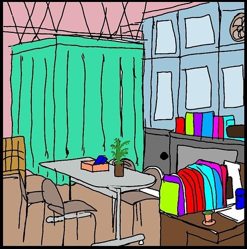
I think for the other two already provided you with very good tips, I personally would just say look a bit more into colour theory for the first one and don't necessarily use too brightly saturated colours like the books. If you put so many super saturated and bright items next to each other, they compete strongly with each other and come off as even more aggressive than they already are.
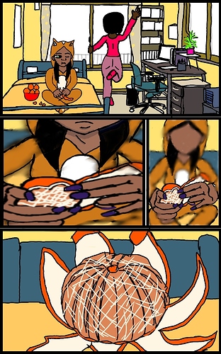
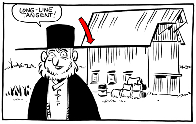
I think for the second one, you need to pay attention a bit more on tangents, especially when placing your characters into the first panel of that page (especially the pink girl's leg and the bedpost look kind of awkward like that). The overall colour scheme is very harmonious compared to the first one, so props to that! I'd still try to make sure that the background doesn't compete or melt with the characters, so maybe try giving more depth to both the room and the characters themselves simply by shading and light. This can give you a really good structure to build upon and doesn't make it feel flat.
Here are some tutorials that I think might help you, especially if you have to navigate characters in your environment (yes, the first one is geared towards animation but I think it helps a lot in comics as well):
What generally might help is having your lineart on one layer and the colour in a layer (or several) underneath so you don't end up with these white gaps where your fill/bucket tool doesn't reach anymore. This also makes editing colours much easier.
Drawing programs I can recommend are Paint Tool SAI (that's what I'm using all the time), Krita, and GIMP. SAI costs around 5,000 Yen at least when I bought it, the other two are free. I'm not sure whether there's app-versions of these, though.