Definite improvement there @abigaillmartin , well done!
All right, let's go through the new batch...
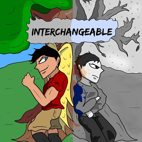
@theyrebothakilogram I can see that you were unhappy with what you had from that border. When somebody adds a border that isn't a really specific design choice, it's generally a sign that they knew the design was missing something, but they weren't sure what. 
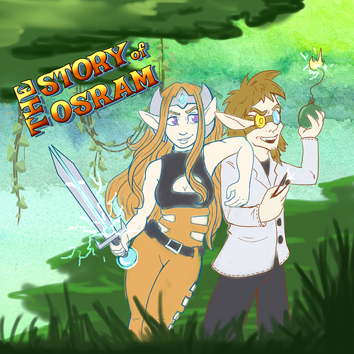
I thought the thread drinking game was going to be "needs more diagonals", but I think it's actually going to be "Don't use fonts that came with your computer". It came up earlier with the Copperplate on Cracking Eggs, and here we have it again with Bauhaus. I can see why you picked it; it's a bold font for visibility and to work with bevel effect (good) and it's fancier than something like Arial, so feels like a title font (also good), it's just... not really right for "modern superhero story". So, you have a decent start, and you're on the right track here, but let me teach you some tricks (which I hope will help a few people on this thread!)...
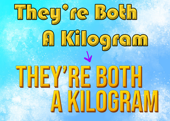
First, get a better font. Here are some on Google Fonts (all the fonts there are free!):
Bebas, Staatliches, Bungee, Squada, Koulen, Bowlby.
And on Blambot we have these free ones that might fit the vibe:
Bulletproof, Government Agent, Lowrider, Ultraviolent, Worlds at War.
Let's use Bebas to keep things simple... And let's write the two lines of text as separate lines, so we can smoosh 'em up together more too...
Keep the gold and the bevel, but change the shadow colour of the bevel to a nice dark orange to add some warmth to that gold Also change the light mode from screen to linear dodge to make that yellow pop (feel free to play with the settings! The "contour" settings can also do VERY fun things!). Second, change the bevel type from "chisel soft" to "chisel hard" to make it cleaner.
Make the stroke thinner and a similar nice dark orange, and now add... a gradient overlay. 90 degree angle, goes from dark orange to white or transparent, multiply mode and lower the opacity til it looks good. You can use "copy layer style" and "paste layer style" to make sure both lines of text share the same effects.
Make a copy of these text layers, clear the style on both. Make these ones just a dark orange. Offset them a little to make a nice, cheesy comic book shadow. Annnnd....
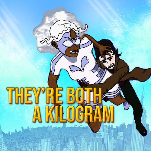
The drawing itself is a good design and sells an interesting idea about the premise and character dynamics, and I think the main issue is you maybe need to look at some reference for sky colours and clouds and things, or to consider putting hints of a cityscape or ground below them. Here's a quick mockup where I messed around with a stock photo of an aerial city view, just warping it to make an exaggerated curve and throwing on a gradient map, but drawing one (or drawing over one) would probably look better. Other change, the sky is more "sky blue" now and lighter so the characters pop without needing that shadow effect around them and increasing the contrast. Threw in a few "god rays" because whenever a sunny sky feels like it's missing something, throw god rays at it, it usually works. I also nudged the characters a little because, (take a shot) Needs More Diagonals!
Feel free to play around and find your own way to do things, but I hope this gives you some ideas. You're at the level now where the improvements to your work are going to be all the little fiddly bits of polish and attention to detail. 
Okay @VersusVII Just want to say, your logo is great. Getting that out the way first. This one, there's nothing wrong with the drawing or rendering; the colours look great with a consistent vibe, the expressions and poses are well drawn.
The problem is... I... don't really know what scenario this cover is depicting because it's so complex and subtle (vampire kid transfixed by glowing paper with maybe arcane or scientific symbol, while this other character feels annoyed that other person isn't interested in the glowing paper?). I can see that it's trying to tell a story, but I'm having to look at it way too long to try to work out what the story is. You maybe tried to be a little bit too clever here, and need to pull back and remember that most people are going to decide in the space of like five seconds if the banner interests them or not. If I had plenty of time to describe my comic, I might go into the feminist themes, the exploration of seeking redemption when a patriarchal system has given you power and stuff, but in five seconds I'd be like "ghdfbj! Er! SWORDS! MAGIC! GAY!?" which is... pretty much what the banner depicts!
If the magic piece of paper is the main focus, it might be better to have everyone's gaze interacting with the paper or the character holding it rather than splitting the viewer's focus between that and the other characters who are more interested in each other. Keep it simple! Also (take a shot) see if you can add more diagonals to the composition somehow in terms of poses, props, backgrounds or something, it'd add a bit of extra visual dynamism.
@UnTalAugustus same issue as above. I like the way the characters are looking at the reader, that's very cool and really draws the eye, but I feel like this banner would be better if it was just those characters bigger to take up more of the banner and then the title written normally in space. It takes too long to work out what's going on with the billboard. Make the characters the stars, not your title.
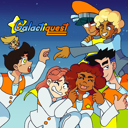
@powerplantanimations This is pretty good! I like the composition of this one and the poses are giving us those sweet, delicious diagonals. Only two changes here:
1. The flowers are making it too busy. Lose the flowers, go for a simple flat BG, gradient or subtle texture.
2. If you can get the characters in there without obscuring their faces with that glow, that'd be better. Always try to avoid stuff over character's faces.
Oh, and use the new logo off your new cover, but I think that goes without saying.
@LostKelp The logo is nice, the composition is solid, and it's clearly getting across what the series is about! It's a good banner with just one problem... It's too dark and I'm having to squint to see what's going on in places.
Fun biology fact: Humans are a lot better at differentiating small differences between light values than dark ones. This means that if an image has a lot of dark values, it can get hard to read. Try to increase the contrast, and maybe try adding a glow or something behind those darker skinned characters so they stand out from the dark space behind them. Even the white space suits here are quite dark, so there''s definitely room to bump up the brightness a bit.
Everyone else, I will get to you soon, I'm just going to take a little break before tackling more.