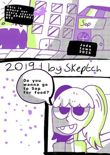
Hi. 
Let me see...Overall I think you need more "air" everything looks too big and too piled up. Just consider distributing your elements. For example, the speech bubble is interrupting the date. You can make that dialogue smaller or drag the second panel lower. The air is a small change that is easy to make and can help you a lot.
I think is okay to have a sketch-like finish, I personally would exaggerate this more, my teachers used to tell us that even disheveled things have to look like they were made like that on purpose, and not look like an accident. There are some brushes that look like pencils or have textures, in case you are interested in exploring this option.
The color contrast is interesting, the screentone of the shadows look a bit strange considering you are using color, maybe the screentone can be removed and you can shade with the purple or it can have a color that is not black.
Of course, this is just a personal opinion, don't take anything at heart. Share more of your art if you need further feedback, is a bit hard to analyze just two panels.