1 / 5
Aug 2020

I made a cover for the first chapter of my comic. I think the title looks a bit weird, like it is blending in too much. Does anyone have any suggestions for how to redo or edit the title in terms of design, style or font? Thank you so much!

  • created

    Aug '20
  • last reply

    Aug '20
  • 4

    replies

  • 267

    views

  • 3

    users

  • 4

    likes

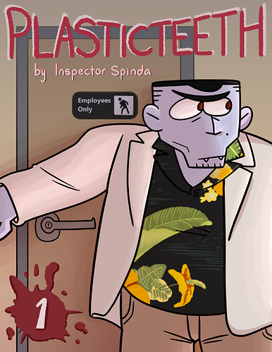
Hi Inspector Spinda!

I like your comic very much, your cover is nice, i like the text font, really reflex the good humour of your trace. If you're looking for more stand out feeling, you should experiment some colours or even patterns on this wall behind him!

I can suggest to desaturate background nore or make it lighter or make the title darker - right now it's bleeding into back because of the same color value. Also the black plane 'employees only' kinda grabs attention and seems like a part of the title because of text and very contrast black tone - maybe write your name there instead? or leave only icon without text
also door frame kinda cuts the title - try moving it up or making wider - regarding the door knob size this door seems a bit too small.
if you desaturate pictire you can see the problem