13 / 13
Oct 2022

I've been staring at it maybe too long, I don't know. It's supposed to showcase the polarity between the two characters and it's a stronger scene that's kind of built up until it's reached, but something just... feels off. I can't quite place it. Like it's lacking or falling flat.

  • created

    Sep '22
  • last reply

    Oct '22
  • 12

    replies

  • 798

    views

  • 8

    users

  • 8

    likes

Only thing I would say is push the poses more. The dark character has good body language but the hands seem like an afterthought. The light character doesn't seem to posing more like just moping around. It's not a strong pose.

I've had a rough time trying to figure out the poses. It's supposed to be a sort of melancholy scene. Not really dreary, but a little forlorn, if you will. A little wary.

Mmm... something about it feels a little flat...

Could be the flatness of the angles the poses are viewed from and how planted the poses are (BoomerZ might be on the money on this one).

It could be that the shading on them is a bit greyish and needs a little more drama, like more depth or some brighter highlights

Or perhaps that the background is a bit flat and low contrast and needs a little more punch and texture?

Maybe try to make it seem like they are looking at each other witthout fully turning their body, like a glance

I'm sorry I'm not good at explaining but I love the art, it's so pretty!

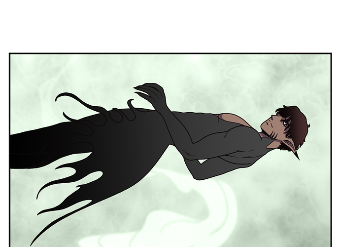
It genuinely could be any of those, and I agree, it feels 'flat'. That's exactly the word that came to mind.

I'll try throwing in some more shading. I was trying to sort of keep the shadow mild to really emphasize the light vs dark, but that might be an issue.

I'm hoping to avoid entirely redrawing the poses. I went through probably four different sets before I settled on these ones and it'd suck to have to start completely over. But if I must, so be it.

Any suggestions? I do want to keep sort of non-dramatic poses. I was going for just standing sort of casually with their backs to each other and just kind of glancing back a little bit. You know, like when you want to look back at someone but don't want them to notice? lol.

Oddly enough that's what I was going for. Maybe I was being too mild with it. It was supposed to be that they were both sort of glancing back at each other without wanting to be caught doing so, sort of look.

For me, I think it might be this part of the outfit:

I don't know if it's meant to be only on one side- but I think it's the fact you can't see the other side, especially since the cut of it is more irregular and you should be able to see it.

Could also be that you can't see his other leg, so he looks like his legs are 100% side on, which can make it look more flat.

The shading really could be more dramatic. I get for contrast it's important to not put the black wearing character in total darkness, but trying a bit of that could be exactly what really makes it pop!

Immediate observations:

  • Too much negative space. The characters are so far apart, and for what? Some smoke effects...? They're pretty, but there's no reason they couldn't be downsized to make the characters feel more like the actual focus of the panel.
    Or, if you want to keep the sense of distance, turn the camera angle, and just make one character smaller than the other. Saves a little space, adds a little extra dynamic~

  • As other people mentioned, the poses are a little 'closed'; they could definitely stand to be opened up a bit. Like, instead of having most of Guy-in-Black's body in profile, twist his torso a little more so you can see both of his legs, and so he's doing more than just peering over his shoulder.
    As for Guy-in-White, he needs much more energy; his pose looks really casual compared to the above character, almost as if it's a comedy panel (like a villain whose arch-nemesis barely knows they're alive; that kind of thing ^^; )
    You could space his legs apart more; give him a torso twist too; draw his face in a more dynamic angle like Guy-in-Black's...any change could help.

  • Add some AIRFLOW! ~(≧▽≦)/~
    This is probably the simplest suggestion...there's a reason 'character stands with their hair/clothes/cape blowing in the wind' is such a common visual: it takes a static, boring pose and lends interest to it by simply contrasting with the more dramatic moving parts.
    In this case, I think a picture's worth a thousand words-- here's a basic sketch showing most of the stuff I mentioned:

Like you wrote, you maybe have been staring at it too long.
I don´t see anything that I would change in the panel

1 month later

closed Oct 21, '22

This topic was automatically closed 30 days after the last reply. New replies are no longer allowed.