gahhhhh your comic looks so cute, i love the soft lines you do, they have a lovely weight to them.
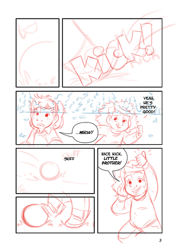
the only thing id point out that could improve on function is one instance of bubble placement:
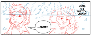
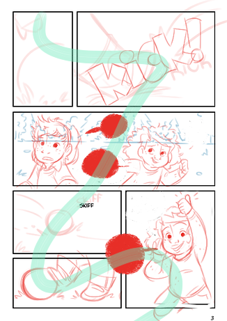
its clear when reading the dialogue that 'whoa!' comes first, but the placement of the bubbles implies otherwise - so readersll have to break out of the flow for a second to piece that together. a better placement could be putting both bubbles, one over the other, in that gap between the kids - space them out a little if thats a problem. generally, i think you could do with putting a little bit more thought into flow - its not a major issue at all, your pages function fine, but the flow could be improved, making the action go smoother. for example:
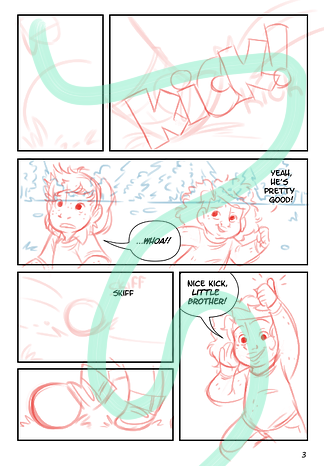
that flow is kinda wiggly, and goes back up on itself. its not that deep, but what if it was like this?
a few little tweaks get the eye travelling across the page with less resistance (i wont say this is perfect tho, ofc, given im jus moving stuff around a little. its up to you how you wanna actually go abt it, but this is an example)
id also say you could use a couple wide shots thrown in there to give a sense of place - was there an establishing shot in a previous page? going wide now and then in a scene with so much movement can be really helpful to communicate the action, and also varies up the visuals for interest.
but besides the speech thing, these pages are functional, all the drawings are super cute and have good movement and all that Stuff. but there are some ways you could make them more interesting and better communicate the action of the scene
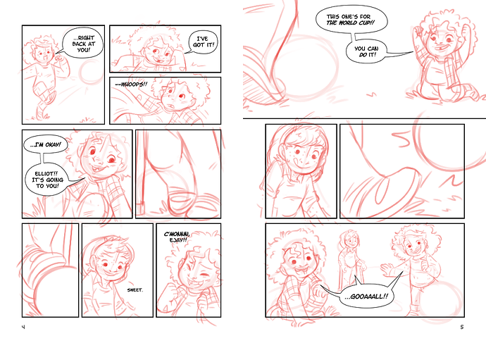
i think youre sorely in need of more bleed panels. you have a lot space around the edges, and you should utilise it! bleed panels are a great way to control the pacing and add emphasis - a borderless panel can take on a timeless character, and evoke feelings of freedom. theres not really any rules on how to do it though (except to alternate - you cant put two borderless panels next to eachother for obvious reasons) so what if that kick panel kicked those outer borders out into the bleed? what if that 'whoa' panel extended all the way out, to show the kid pausing in awe. what if 'nice kick!' girl was on top of the panels, popping up from the bleed? or maybe 'right back at you' stays nicely in its panel, but the ball erupts out into the gutters?
you could also benefit from varying the shape of your panels. putting a panel at a slant is a really easy way to accentuate the action.
these pages are really cute, youve got a great variation of shots to keep the reader interested, the flow is functional, and i love all the drawings! i just think you need to give yourself permission to play a little more with it.