I think of choosing the colour palette or at least colour vibe of a piece or project as a really important part of planning, alongside things like "what tools am I drawing or painting with?". The choice of colour has such a big impact on how a piece feels.
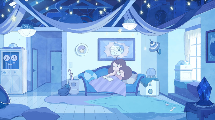
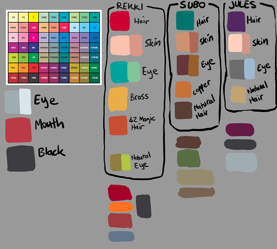
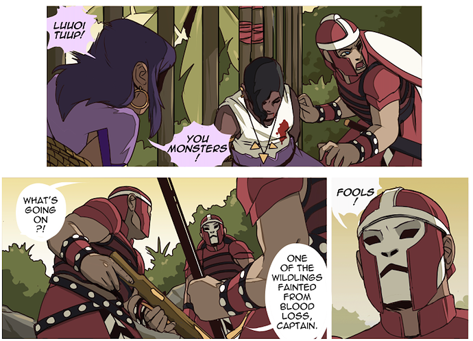
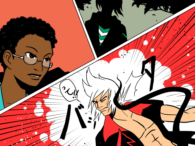
Errant's palette used the colours of pre-digital print comics as a starting point to inspire the general value and saturation, so you get these very bright tones with high saturation at the lightest values, but more subdued midtones and "black" that's a dark grey-blue:
Backgrounds tend to be suffused with colour too to fit the vibe of the scene, usually a much softer colour which gives the vibe of very bold characters in a rainy, misty place like Britain.
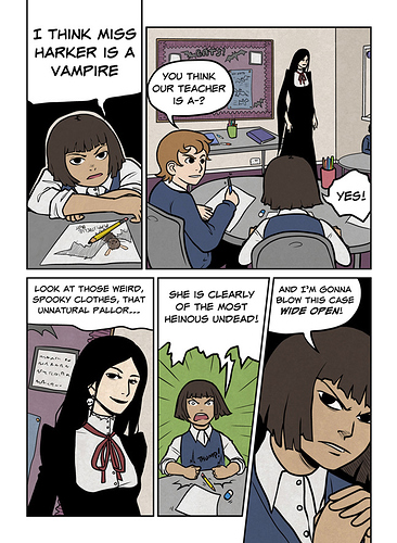
But with other comics and illos, I might try very different approaches. For example, going really subdued and low saturation on all the colours gives a "gloomy" and "down to earth" vibe:
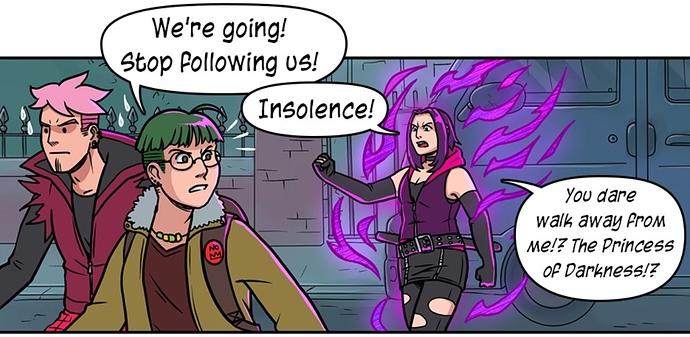
Or going super-high saturation on the mid-tones because the black and white is pure black and white so it won't be overpowering which feels very pulpy:
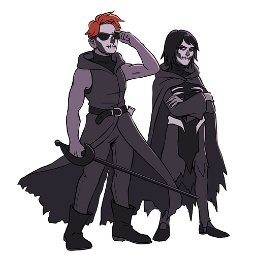
Or maybe sometimes for individual illos and fanart I'll do stuff like doing nearly the whole image in shades of purple with a single pop of contrasting orange:
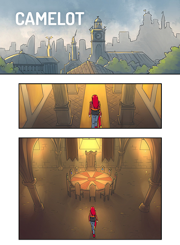
I'd usually avoid this kind of approach on a comic unless it was short or had a really consistent vibe in terms of tone and stayed pretty static in terms of location, because the main thing I want from a comic colour palette is something flexible. Errant's colour palette is much broader and the rules still work if Rekki goes to somewhere where the atmospheric colour is gold:
I'd definitely encourage people to think about colour; it can really give your work a step up in how polished and appealing it looks. There's a great book called "Color and Light: A Guide for the Realist Painter" that everyone should read, regardless of style.
Oh and also watch this Youtube video! It's great!