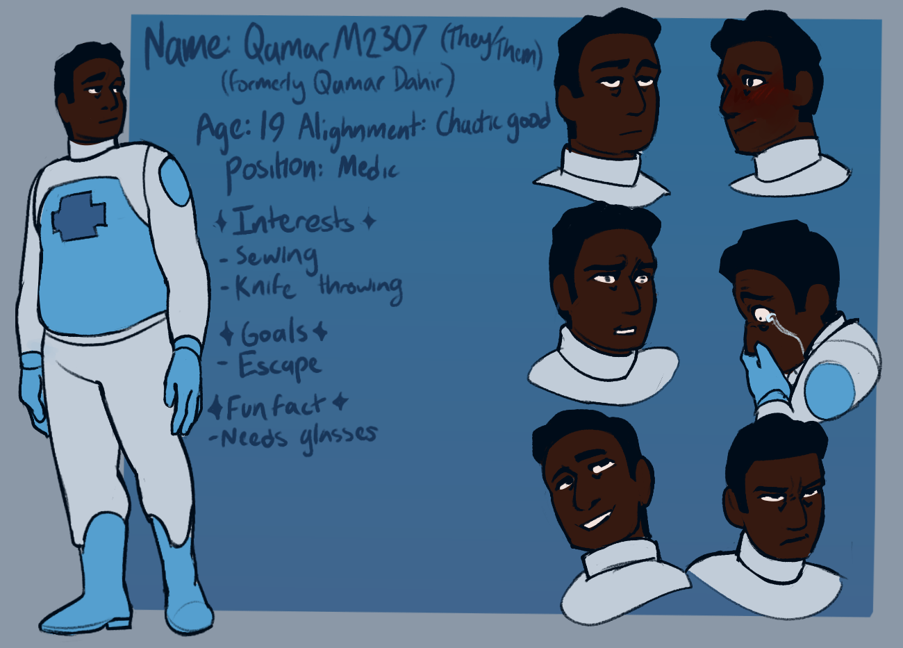
So far, when see the artwork of the character, independently of the comparison right besides one another, I can tell that this is a dark skinned character and that there is a very warm and light filter to it. The skin is in fact a tiny bit lighter compared to the flat coloring at the side
Still I want to put a very dumb yet useful example.
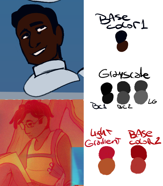
Let's say I'm working with a specific hue or gradient. 4D312D (The current color selected) is my darkest color here, that means, the rest of my colors regardless of the wheel should be limited to that one, anything on the blue area would look off (Thus, what is happening to your second image)
Another thing that I always notice is that people tend to oversaturate dark skintones, believing that you have to go all the way to the right in the color square, but the thing is that for flats, its not recommended to use it unless you're planning on adding new lights, shadows and undertones.
Making dark skintones to be warm all the time regardless of the overall light, the reflection of other colors, or avoiding implementing said dark skin to the rest of the color palette, is a commonn mistake mostly caused by the fear of making someone too light out of an already established aesthetic,which was generated by the fact that in media, professional studio photos and well digital and traditional art in general, the skin is always manipulated so we all feel like "Oh we need to make it more saturated, more orange, more warm" when in fact and in reality, eye to eye depending on the ambiance, type of light, other colors surrounding us... dark skintone is not necessarily warm.
I always like to talk about this, but I'm dark skinned, not black but more "olive" per say, and the common mistake I've dealt with people drawing me or applying make up on me, is that I always end up looking orange. Because my skin is more ashy, less saturated and has yellow, blue and green undertones
Personally, I prefer to work like this (Of course there are exceptions from time to time, but I don't tend to go outside of that square):
I believe what you could do to have better ideas about your coloring, is checking how it'll look in grayscale or with a black to white gradient correction layer. Or, implementing additional sources of light and shadows.
What you could do is check different references from pictures of dark skinned people. Let's use Will Smith for this
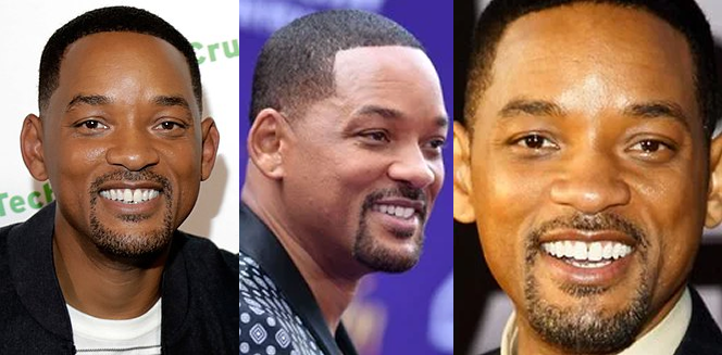
In the first one he looks very warm, high contrast, but we can tell this photo has a bit of production, more than a single source of light and I believe is a warm one, judging a bit by the shadow, besides there is a background that'll doesn't provide much of a undertone once it bounces back to the skintone
The second picture, we can tell here that there is a neutral or a "blue" light, making him look whiter and even less warm, this also adds with the purple background.
On the third image, Will is back with a warm light, this one more yellowy and feels more like a combination of images one and two but with a very strong yellow undertone.
The first image you provided, reminds me of the second picture, which, after all this rambling is not necessarily bad. Even more, the comparison of each color once under a grayscale gradient proves that you're not whitewashing just having a different light source and filter.
The progression is not off so I'm willing to believe this is not whitewashing, just that you're way too used to the flat colors of Qamar being quite oversaturated and heavy in the eye that a more relaxed scheme feels off to you