Sorry this took so long, life and stuff.
Overall, the art is fine. Characters are distinct from one another, there's obvious care put into the backgrounds. And @coppermouflon got into all the to other things I would've mentioned and I agree with their points. The devil is the details. Three things stick out to me as issues:
1. Construction
2. Color
3. Visual storytelling
So let's get into all three.
Construction
Specifically, the construction of your backgrounds, though some things can be said about your characters. The opening shot in page 1, the bits of background in each panel, and the first panel of page 3, all suffer from wonky perspective.
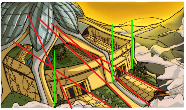
In this panel, lines don't end at the same vanishing point, lines that should be parallel aren't, and there's not a clear horizon line. All and all, it looks like this, I'm assuming, temple is sliding of the hill it's built on. And over all the whole building looks flat.
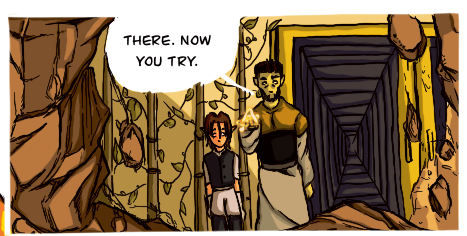
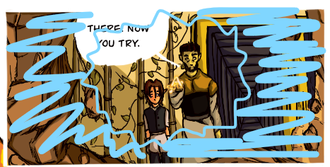
This panel's perspective if off because the hallway that leads behind them looks off. It implies that the horizon line is higher than where than character's feet are. Now that can work, assuming that the hallway goes up a hill. But in that case something else as to give. If the hallway is leading up, then we shouldn't be able to see the ceiling of the hallway. Also, that hallway implies that the vanishing point is off to the side, but we're looking through the rock and at the characters from the front, with no perspective added to them at all.
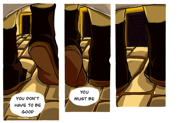
And in the final panel I mentioned, the vanishing point changes entirely. On the cobble ground it goes one way, then breaks to go in a different direction for the hallway. And then as I mentioned before, Lines are not parallel where they should. Now, to give the benefit of the doubt, the goal may have been to have the pillars in the back come off as more organic and tree like. And that's fine, but they should still be consistent.
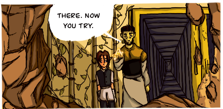
Not me realizing that those are doors not hallways. Not that... Honestly, I'm not trying to tell you what you can and cannot draw, but I would recommend changing the design of those doors to something else. That really confused me
  .
.  I still think there are things that could you could work on in your perspective drawing so I'm just going to leave the critique as is.
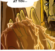
So just be mindful in the future. Check and see if your drawing program has built in rulers or perspective tools. Look up some tutorials on youtube or in an art book, and brush up on your perspective knowledge. As for your characters, there's nothing too stark to discuss. Because the way you construct characters is more realistic, be cognizant of your construction when you break faces to push expression. It can look a little off. It feels like there's not enough chin space in these to panels and his back teeth are missing.

And lastly hands. Look at your own hands. For both men and women the middle finger is usually the longest finger, followed by the ring finger in men, and for women the pointer and ring finger are usually the same length. And the pinky is always the shortest. You don't have to follow this exactly, but be aware that the fingers are different sizes when constructing your hands.
Color
This group of pages are very... yellow. Now that's likely on purpose as this scene is taking place at... it's sunset, right? Okay, so the reason I'm slightly confused is because there's a lot more orange (and pink, dark blue, and violet) involved when it comes to coloring a sunset, especially one where the sun looks as low as this one does. The shadows would be harsher due to the dimming light and due to the fact that they're in a compound with high walls that looks to be far above the horizon line. I'm not saying there would be no light in the scene, just not a lot, and certainly not enough to have blurred, nearly white highlights.
Enough about how to color a scene, let's talk about the colors of the scene. The local colors. Honestly, and this is going to be a little harsh, for this scene, everything kinda just blends into a yellow and brown mush. Even the characters fall victim to this, specifically the mentor. He kind of blends into the back in terms of his skin, but fortunately his dark hair saves him. Generally, the value structure on your characters are pretty good.
 Colors are different enough in value so that characters don't look flat.
But the background values are all similar in color and value, and the little bit of light green isn't enough to contrast the rest of the brown and gold. The background look flat. And because there aren't many panels showing the full body of the characters in the space (likely due to the small amount of pages, let's be real) with good perspective, characters aren't really grounded. They're not out there floating, but they feel detached from the environment.
Now this might just be a personal thing, but the the skin and hair of the prince character are a little over saturated. Maybe it's because of the time of day in the scene, maybe I'm just being difficult.
Some of the things I mentioned are things that I also struggle with. I can color a scene just fine but making it dynamic and getting the colors to match the mood and not just the location, are things I also need to work on, so you're not alone in that.
Visual Storytelling
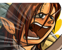
I'm just going to say it, there are too many close ups! Why are there so many close ups? There are about ten panels where the focus is solely on the characters' faces. And that's fine for dramatic moments for when a reaction shot is important. But when they're every other panel, they lose their sting, the drama, and importance. There are only so many times a reader will tolerate staring deeply at characters' faces. Because it can be uncomfortable to just look at a face most of the time due to it being a very suffocating angle. It also reads like the illustrator is isn't capable of drawing full body shots, which you obviously are.
Let's focus on specific panels.
Now this panel is disappointing because I know what you're going for, the execution is just lacking. If you want it to look like the viewer is looking at these two characters through a hole, then draw it like that.
Have the hole encompass the characters.
Now, I understand that in the previous panel the rock wasn't shot through but broke apart upon being hit. But if that's the case, why have the reader look from this perspective without at least an interesting shape made in the rock to give reason for the angle? You're better off viewing the rock from behind them.
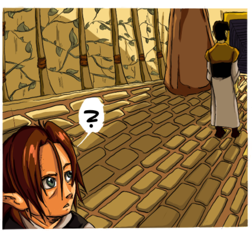
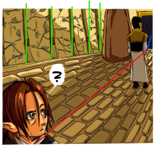
This group of panels confuses me. In the first one it looks like they're standing right in front of the doors, but a page later, they're both far enough away that the mentor has a room's length amount of space before he reach the doors! Did they teleport? Were they always that far way from the doors? And where did that rock that's right next to the doors com from? It wasn't there before. Continuity and spatial understanding. I feel like you need to work on those. Keep things consistent panel to panel so that readers aren't confused as to where everyone and everything is, especially since this is going to be an action comic. It's very hard I would know, but it's very important. If it helps, you can have a map or overhead layout of a space before you draw a scene in it. Consider doing that.
All and all those are the three major things that I noticed that might be issues for your comic. All in all, this is pretty solid work and you should be proud of the quality. So, good luck to you and your comic!


