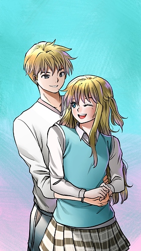
Cute cover so far! I think it looks pretty decent :)) JSYK, I'm not a professional artist AT ALL, so feel free to take my words with a grain of salt!
For the background color, I think you could probably make it less saturated so the eye is drawn to your characters! Also I'd maybe suggest making it a warmer tone to help with that?
The girl's hand looks fine, I think what would help is if you shaded with a color that wasn't grey since grey usually dulls the palette. I'd suggest shading with a mid-pink/orange on multiply since you want rom-com vibes (i dunno those colors always said fun and flirty to me lol)
Also this is my personal opinion, but I would change the color of the male's shirt. Mostly because it seems like the characters blend too much into each other right now. I'd suggest maybe a light orange or a maroon? But you're the artist, so that's up to your discretion
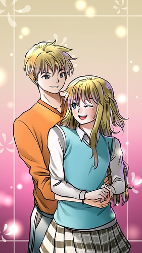
This is a cute background, and I'm assuming this will be for tapas? If i recall correctly, the dimensions for it are 960px by 1440 px, so I'd make sure the title art is that size so nothing looks weird if you distort it.