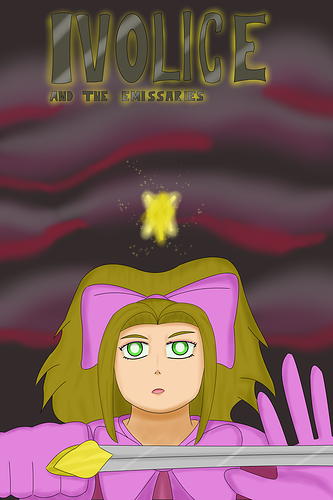
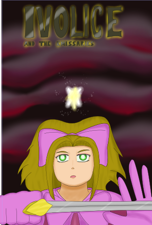
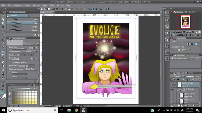
My concern is mostly that I can't read your title. At all.
I'd recommend not having dark colors in your title and a dark background. Also if you have a textured or gradient style background, having the gradient/multicolor title is also distracting. My eye really can't figure out what to look at.
Perhaps try making the the title the bright green of the girl's eyes, or the color of her clothes. Then have a sharp outline of black or a dark color to give the letters crisp edges.
Like others have said, I would also move the girl and the star even more up the page. Perhaps blur out the background a bit to really set the focus on the girl.
Just suggestions.