WARNING OPINIONS INCOMING:
I like it overall. The colours are nice and the anatomy seems solid.
Perhaps you could work on the pose, one of the arms seems to be doing nothing and she's just standing doing nothing.
About one-third of the image is blank and empty and I think this is a no-no in terms of composition but I'm no expert. If you want to accentuate how strong she is then maybe consider having her take up the whole page. If you divide the image into four squares then you can move the character so that she's occupying most of those four squares. Does that make sense?
Edit:
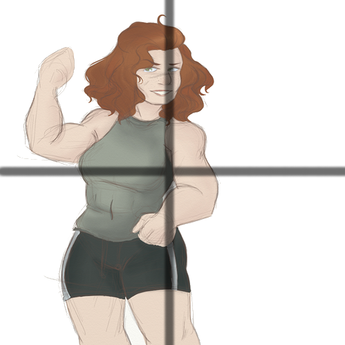
So there're two squares that are barely filled. Which I think makes the "balance" of the image skew to left.


