Thank you for the kind words for my comic! I’ll say that your nitpick will be addressed in the next two episodes - so I look forward to sharing them with you. :>
I took a look at your comic, and here’s what I have to say:
Positives
* I really like the concept of your comic - it’s a pretty fun spin on Classical mythology. I appreciate the diversity of characters too - I strongly feel that more comics need that.
* Your pacing has improved a LOT over the course of a few updates.
* There’s a good sense of fun and humor throughout- particularly in the dialogue. The facial expressions you draw also help.
* I generally like the mood/lighting of your comic. I think the Mycenaean scenes are especially well done in this regard.
What could be improved
* As you said, I do think there’s some work to be done with the artwork. But aside from the tried-and-true advice of “use photo references” and “do life drawing/study anatomy” (which I think would help make your characters feel solid within their world, I’d recommend using a color instead of a grey tone for shading with a multiply layer (I like purple - but it’s really up to you).
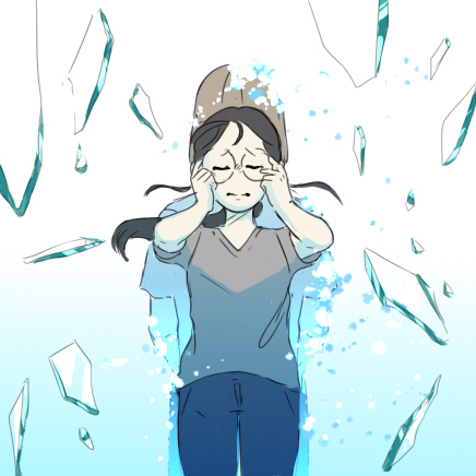
* I also agree with you that the speech bubbles and panels are very crowded - I had trouble processing a lot of what was being said, even though your choice of font was very good.
With the bubbles, a good way to start fixing legibility is to break them up in appropriate places in your written sentence. This image demonstrates what I mean. This makes it easier for the viewer to process what your characters are saying.
* As for the panels, I’m assuming you’re following a page-by-page comic format (instead of the scroll down/webtoon style). If that’s the case, then my advice would be to carefully consider the size of each panel you make, and what you intend to express through them. The larger the panel is, the more narrative importance it takes up - and the slower it makes the pacing.
I hope this helps!
Now, to replies:
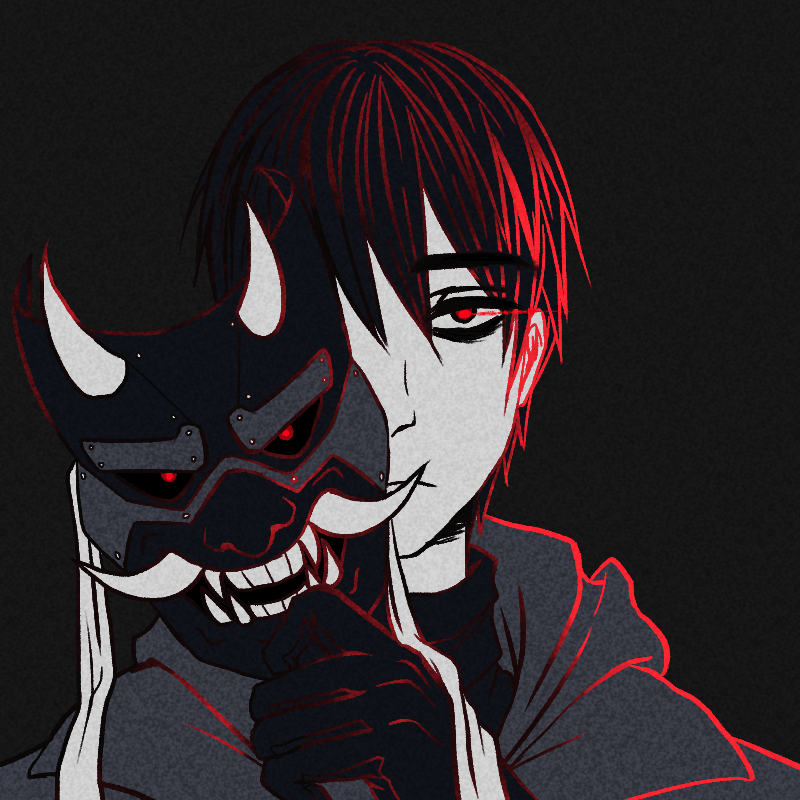
@Ramonkey Thank you for the lovely comment on my webtoon! I really appreciate it. To address the issue w/ my lineart, that was definitely intentional on my part. I find it very difficult personally to work with an aliased brush - so that’s why the linework feels more pixelly than some other webtoons.
@mikeampao1 Thank you for the kind words on my webtoon! I’m glad you enjoyed it. I’ll try to get to reviewing your webtoon ASAP.
By the way, if you do want to earn more subscribers - I strongly suggest promoting your work on social media. That way, you’ll be able to reach out to a wider audience.
@Lonker I’ll take note of that, haha. It’s okay if you can’t review for my comic - I’m cool with that. But I’ll do my best to give you some sound advice as soon as I can.
@IndigoShirtProd Yeah, this is actually something that I have major issues with in my overall work. It’s extremely annoying to post an episode that was ‘done’, and then discover that some parts haven’t been filled in or cleaned up. I don’t really know what I can do to change this, though. Any advice would be appreciated.
As for the 3D models, I definitely agree that the first episode’s usage of it is kinda clunky. It was my first time using 3D models for published work, and it very much shows. To be fair, though, I do think my second episode’s usage of the model was better - since I knew my 3D model workflow better then than I did for the first episode. I dunno, though...
Just an additional note for story context, this webtoon is for a short story contest, so its storyline will end in 2 episodes.