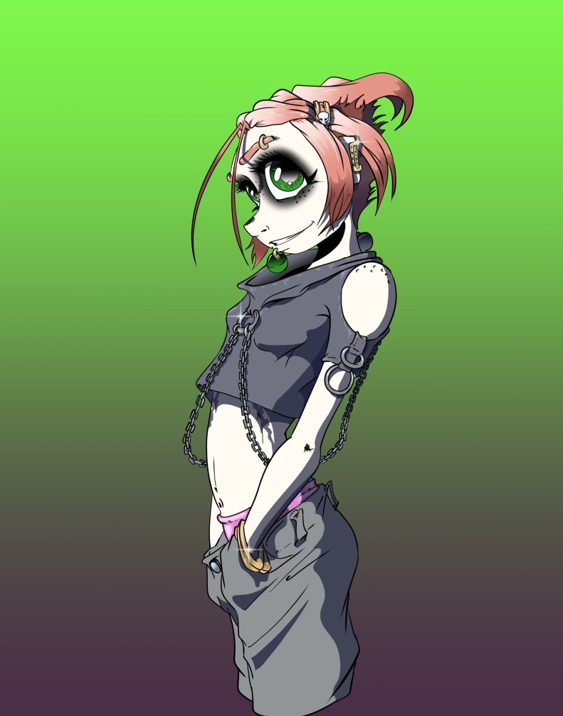
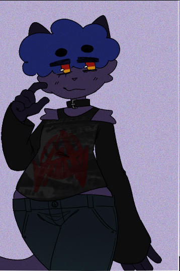
at it's base i'd say it's pretty good but it could be the direction of the light or color choice that could be making things feel off. like taking this and doing some editing (redoing flats, new shading gradients, and a texture layer) i happened to get this from the time that you sent this reply to now
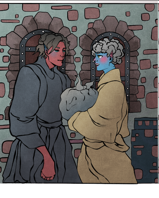
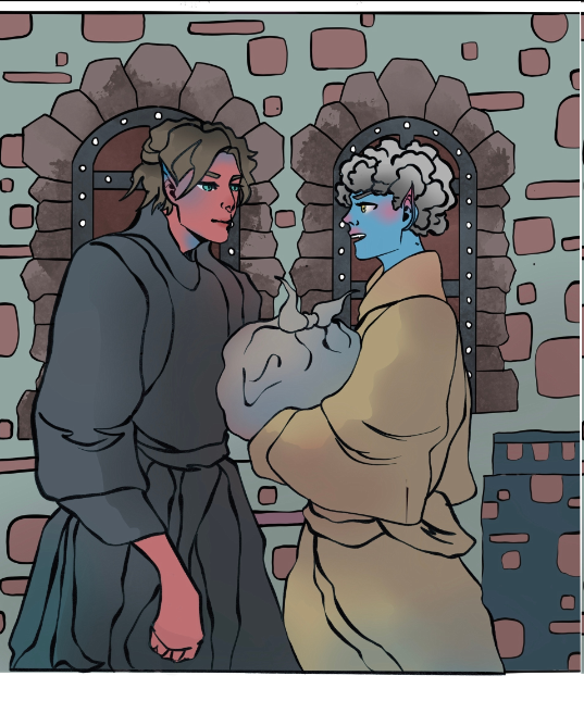
like for the most part it looks really good but whenever i feel doubtful about lighting or shading i just do a two tone gradient overlay to emphasize and then a noise or texture like this noise pattern i got from photoshop and turned into a brush

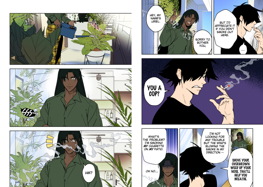
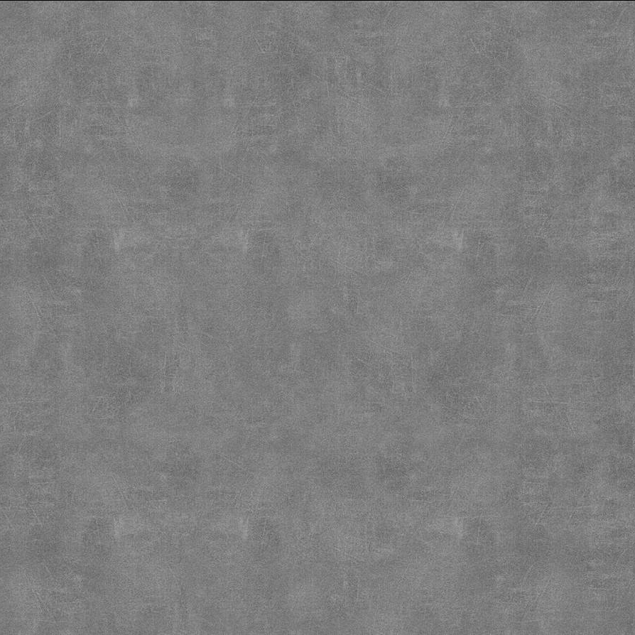
or this texture overlay from sandflake on deviantart
then i take those and set it to an effect like overlay, multiply or hard light that way it gives it that nice gritty/paper look to it
when i do it for my own work it's kinda like this
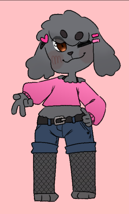
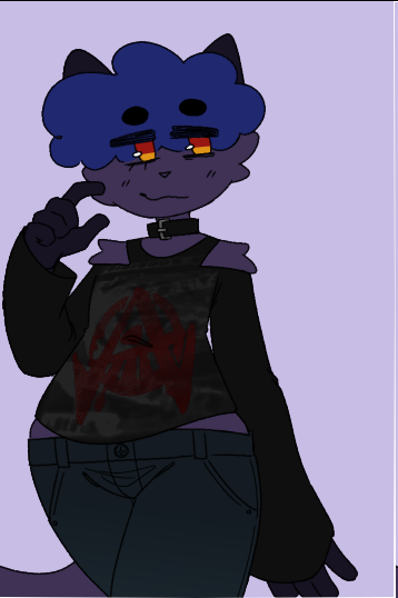
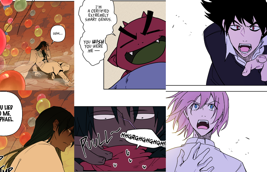
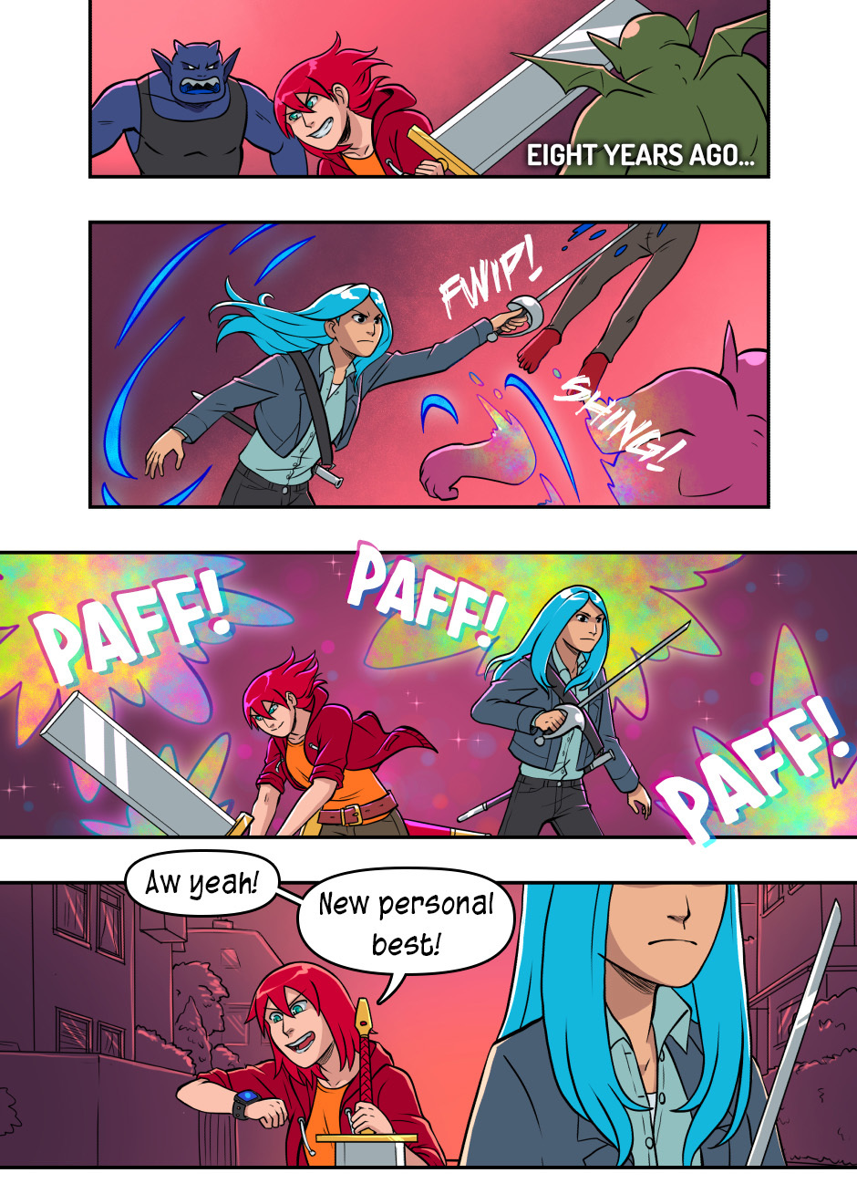
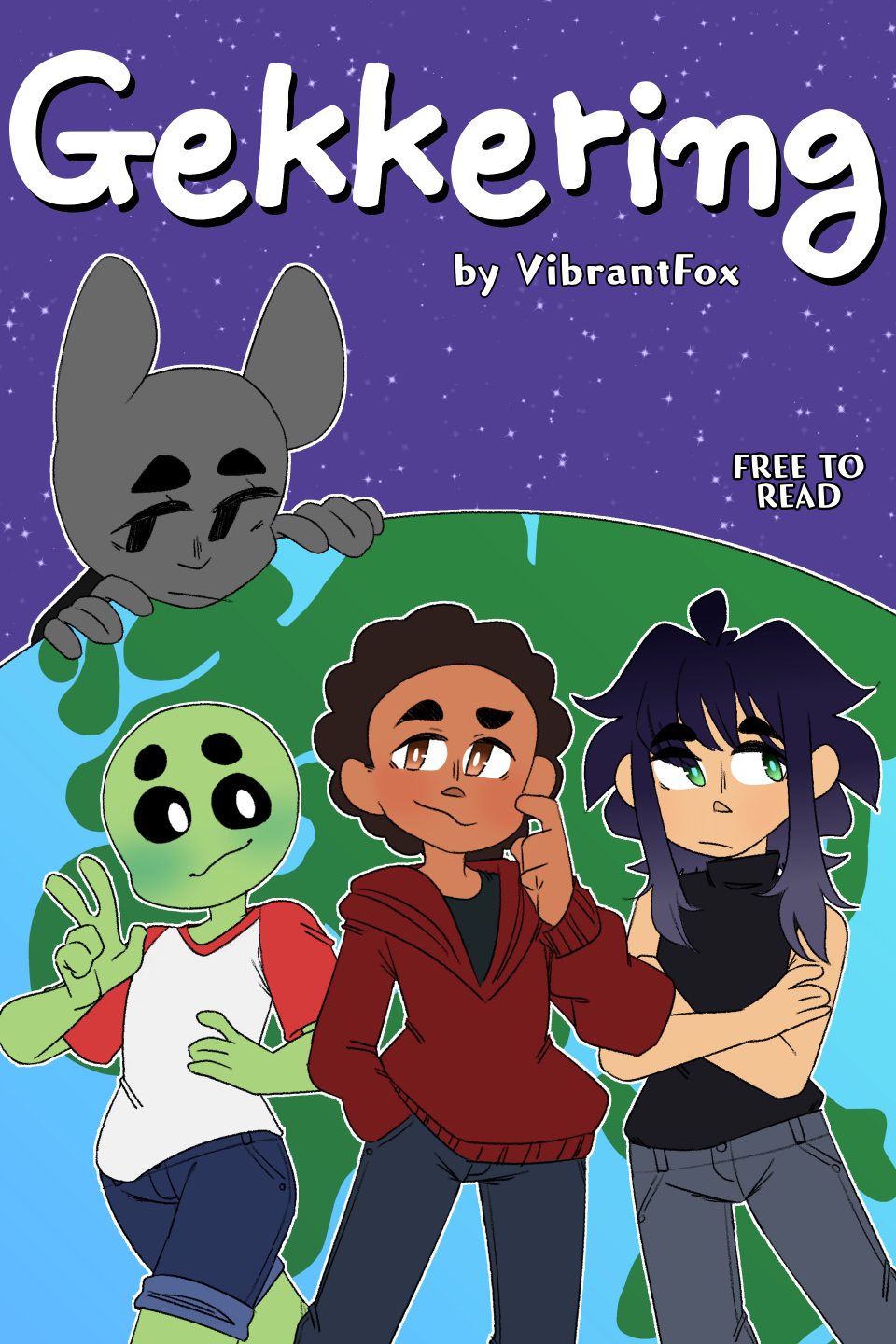
or to give an example of a comic focused style this ones really old but about the same as how i do colors now with flats and then some gradients or small details for things like hair, blush and clothing
probably the biggest reason why i like the texture overlays tho (especially the sandflake one) is that it helps give flats a bit more volume so it can look like there's that brush stroke look to it without breaking my wrists to get it. granted i sometimes break my own "rules" and go ham on specific drawing or panels coz i want those to pop the most but i think it's not so bad coz it can sometimes help to guide a reader to those things or add to pace or flow