2 / 20
Apr 2021

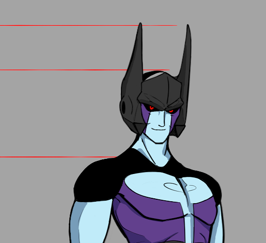
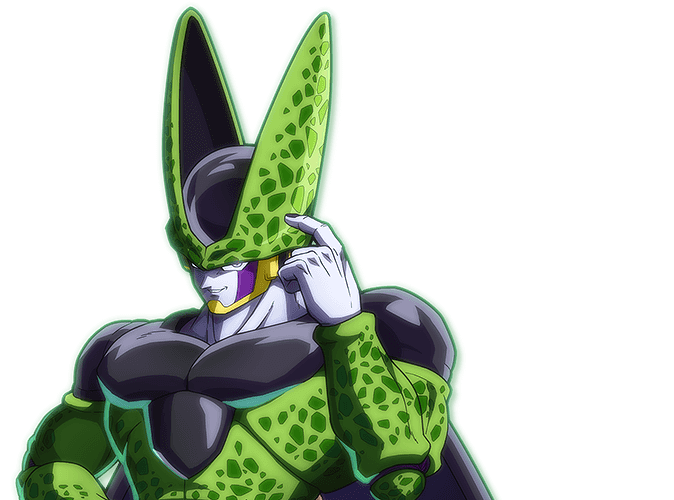
I'm currently working on a project that I hope to eventually release as a product but myself and my co-creator have been worried over the design of one of our characters, whom we believe may look too close to the Dragon Ball Z villain perfect cell,
I suppose I should say that our character Is supposed to be a direct nod to cell, and perhaps dragon ball as a whole ,but with our concerns we've taken up trying to change the characters entire personality so as to avoid falling to close that cell area,
there are even worries regarding certain character traits that are simply unavoidably close to cell (made by a mad scientist, bio-mechanical, kind of an asshole) that will make the character just seem more and more like a ripoff,
but at the same time both of us really like his current design and worry that by redesigning him we'll lose some connection to him as one of our favorite characters, so anyways I wanted to see whether or not our worries held any merit and figured I'd let an outside source decide

  • created

    Apr '21
  • last reply

    Apr '21
  • 19

    replies

  • 2.0k

    views

  • 15

    users

  • 22

    likes

Thanks for the reply! Hopefully more people are of the same opinion

Yah honestly I’m seeing more stars team but I still think they look different enough ^^

i think making the head adornments not so close to cell's crown shape might be good; maybe tilting them backwards at a 45 degree angle perhaps?

I do see similarities in the crown and the purple face markings but other than that he has a different feel to him. I personally don't take issue with it.

It can vaguely remind people of him but frankly speaking, if you hadn't pointed it out, I wouldn't have noticed :sweat_smile:

Lookin more like the Decepticons logo if anything

Looking at him feels more like humanoid Megatron with Starscream's smirk.

And anything else is like as if Cell and Frieza had a disturbing affair. XC

But he looks original nonetheless.

Certainly reminiscent, and as a hardcore Dragonball fan, I can tell he's a nod to Cell. But that's really about it. His color scheme and design overall is still different enough to be a distinct character. If one isn't a Dragonball fan, they might see Batman before they see Cell haha

nah man, looks fine
and it's completely fine to reference stuff (meruem is pretty much a cell rip off, and that was never a problem for him), so there you go

I think you maybe can change his makeup and hat a bit? but it looks more like inspiration, so I would say no, not that much; he doesnt look like a copy and that's what matters

I think your design is fine. I am an authority on cell because I had a crush on him when I was 15. Bye.

i just wanted a man to karate fight me over the horizon. No, I don't know karate.

I think it's the shape of the hat (Which is only "both have two side pieces that go upwards"), skin color, and those purple stripes on his face. Other than that, nothing similar, I'd say.

I don't wanna be that guy, but he does look a little too close for my taste. It's probably the hat and purple face stripes. I'd say maybe change one of those up a little to distance him just a tad!
My votes on the face markings; maybe a different pattern on them instead of just straight lines? Like, maybe a zig zag down? Or maybe something that references any other origin point he may have; he's biomechanical and made in a lab, so maybe like, a barcode pattern or something? I don't know, I'm just spittin' ideas.