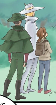
First thing I noticed were your faces. You're clearly going for a style here, and I don't mind that, but you have a lot of places where it's not working.

This isn't a 'realistic skull' that I've drawn here by any means, but it's a geometric shape that is much more analogous to a real human skull.
Like I said, I know you're going for stylization, but the way you've deformed the cheekbones while leaving the chin in roughly the correct spot makes it kinda just look like his face is melting.
I think a great example for you to study would be Nichijou. It's got a similarly simplistic, cartoony art style that moves the 'point' of the cheekbones down, but does it in such a way that it feels natural and cohesive with the chin, the noses, and the eyes.
The faces are almost rectangles, with just a slight curve across the bottom for the chin, but the cheekbones being so far down don't jut out and draw attention to themselves, which is the issue I was seeing all over the place in your comic.
Again, I wanna reiterate, I'm not telling you to change your style or make your art more realistic, but as I've told so many people in this thread, you've got to know the rules before you can break them. Practicing realism and life drawing is useful for EVERY artist at ALL TIMES, even if your art is super simplified and exaggerated.
Speaking of exaggeration, you simply aren't using it enough.
For a more realistic style, you might be able to get away with more minimal movements, but one of the greatest strengths of such cartoony art is the ability to exaggerate and go over-the-top to really sell your reader on the movements.
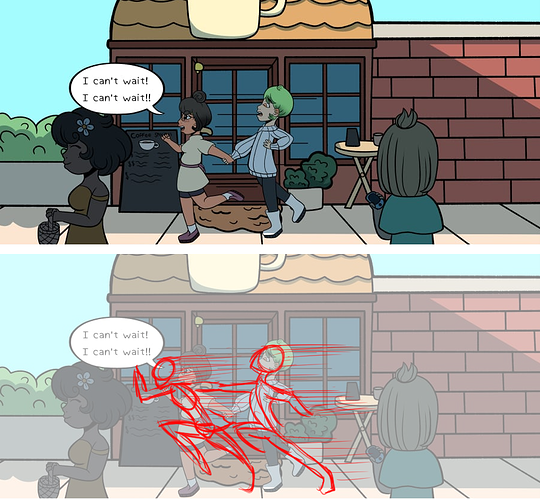
Remember that in comics, you're working with static images that are meant to trick the reader into thinking they're actually moving, so if you draw an exact snapshot of what something in motion would look like, it's going to look very simple and flat compared to actually being able to watch the movement happen with your own eyes, which are capturing the before and after moments and putting them all together seamlessly in your head.
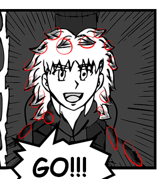
So when you draw a character running...
You have to REALLY draw them running. Push those action lines, have the characters lean into movements, go further than what they might look like in real life (again, KNOWING what it would look like in real life helps you do this better. Hence, knowing realism is still a good tool even for very cartoony artwork)
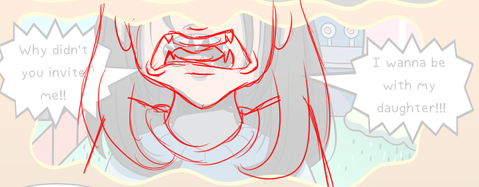
Same goes here: I recommend not going for the full spike-tooth mouth unless you want a character to REALLY look evil, so instead I just exaggerated the canines in her mouth to look like fangs. The mouth shape, however, can be larger, and more angular (again, knowing how different types of loud vocalizations look in real life when doing them helps this tremendously), and I added the little wrinkles under the corners of her mouth which technically probably wouldn't be there realistically, but they help sell the idea that her face is deforming in 3 dimensions, making it a lot easier to read the anger quickly and effectively.