This comic makes me angry.
like... very, VERY angry.
Trust me when I say this is a good thing.
If your comic was just shit, I wouldn't be mad. Might be disappointed or annoyed, but I wouldn't be filled with the righteous indignation of a thousand suns if you were just making a bad comic.
The problem here is that you're making an amazingly cool and interesting comic that I really WANT to read, but cannot because of some crippling mistakes you're making.
I'm about to rip you a new one, but I want you to understand: I'm being extra harsh here because I genuinely think you've got potential for something incredible, and I hate seeing it hamstrung like this.
Okay?
Okay. let's begin.
This enrages me more than I can possibly put into words.
Never, under any circumstances, should this be necessary. Absolutely not. no. stop.
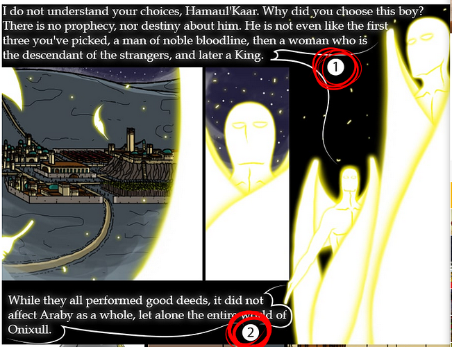
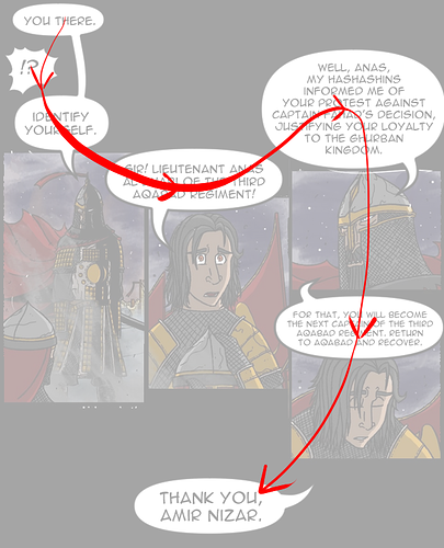
IF these numbers are necessary, then you have failed as a comic artist.
there are no possible situations, not a one, where it is okay to put your text bubbles in an order that would make it so difficult to tell what you're supposed to read next that you need to label them with numbers.
If the numbers are required to understand, you have failed.
If, as in most cases, the numbers are not required to understand, then they are MASSIVELY distracting. They're constantly pulling my eyes away from just looking at the art and reading the text, which is where you want your reader.
I've said it multiple times in this thread, but even a TINY amount of time spent not immersed in the story can be catastrophic. Comics ride this razor's edge of immersion, relying heavily on the reader's imagination and unconscious mind to connect the dots. Even a split second of time spent consciously thinking about what comes next or what the image is supposed to convey can ruin that: it changes that unconscious flow of understanding into a conscious thought process, and it can be really difficult to stop once it starts.
flow and clarity absolutely have to be your top priorities at all times, and using a crutch like numbered reading order on your text bubbles is going to kneecap the natural ability of comics to be read smoothly.
If you're running into a situation where you think the reader might not know which text bubble to read next, then space things out, make bigger panels, bigger spaces between them. You are feeding information to your readers, and if that information is delivered to quickly and too densely, then they won't be able to parse it and follow the story. This is part of 'pacing': making sure the information is told to the reader at a steady rate that doesn't become boring or repetitive, but also doesn't overwhelm them with too much at once.
here's some more thoughts on lettering.
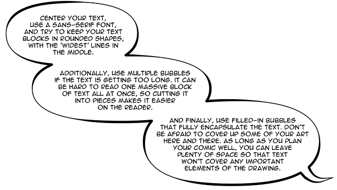
I understand that you're trying something stylistic with the white text in the gutters between panels, but it simply isn't working for you. Traditional bubble styles work, and they have been used for a very long time without changing for a reason.
Once you're very comfortable with lettering, you can do some things to experiment with it, but for most situations, normal-ass comic bubbles do exactly what they're supposed to do and they do so very efficiently.
Generally speaking, I love your color palettes: the bright, saturated colors and period-accurate clothing makes for a really unique and immersive fantasy feel. That said, your linework is very flat and static, meaning you need to pick up the dynamism in your coloring to compensate.
See how on the right, I just made the background a little darker and a little less saturated, while brightening up the two guys in the foreground? it's a fairly small and subtle change, but it helps reinforce depth quite a lot. If you're going to be keeping with this ligne claire art style (which i think you should, it works with the sort of storybook feeling you've got going on, then you NEED to be able to use the coloring to add depth.
And I'm not just talking about highlights and shading: that's one part of it, but your overall palette choices need to be working to help the reader know quickly and concisely where things are in the panel and what they should focus on. Saturated colors, warm colors, and light colors tend to come forward, while desaturated, cold, and dark colors tend to feel like they're farther away.
Contrast between any of those pairs (warm/cold, Saturated/desaturated, and light/dark) will draw the reader's attention and help them intuitively understand that there's a distinction between different elements in a drawing. It helps make things feel like real three-dimensional spaces instead of flat coloring book pages.
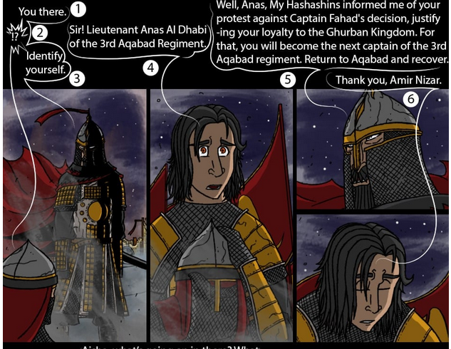
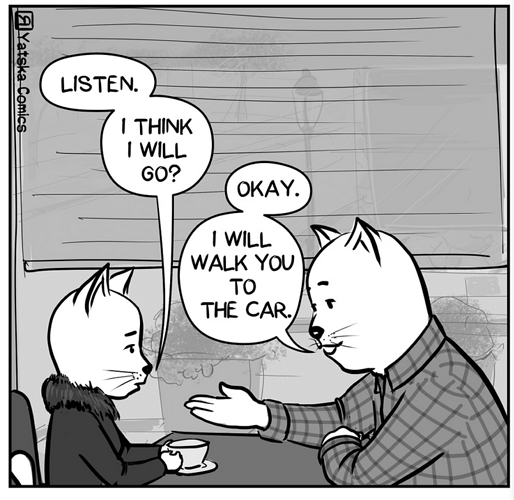
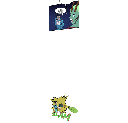
This is a great example of where your lettering is killing you. Having all of the text forcibly shoved up to the top makes it so my eyes are jumping from the artwork up to the text, identifying which bubble Is next in sequence, reading it, then back down to the art. it's jarring and uncomfortable and makes for a really awkward reading experience.
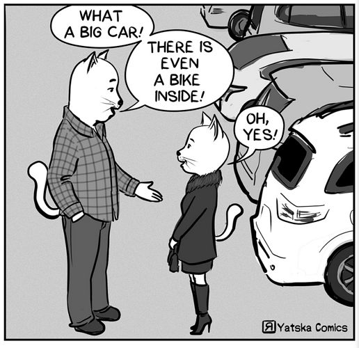
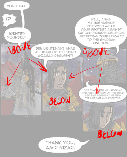
watch what happens when I space out the panels a little and place normal text bubbles with a little bit of care and focus put into the composition:
Now there's so much more going on here:
for starters, the eye flows naturally from one bubble to the next: there's no need to label which one goes in which order because it just makes natural sense.
additionally, this allows us more freedom in composition: Nizar (a figure of authority and power) is LITERALLY above Anas in the composition, just as he is FIGURATIVELY above him in status and strength
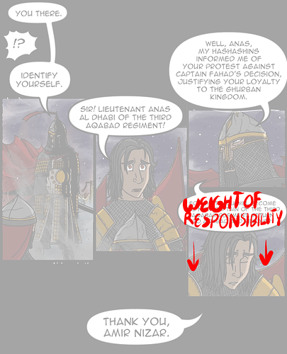
this one's a little situational detail, but the text bubble that is placing the responsibility of leading the third regiment is now able to be placed quite literally on top of Anas's head, the figurative 'weight' of new responsibility literally pushes him down.
Finally, after all of this, there's a lot more blank space underneath these panels, making it easier to transition into the next scene: the final bubble at the bottom is allowed to linger a little bit and make it feel more like a transition or a fade-out in a movie, naturally giving a little breathing room to ease into the next scene.
This is what I mean when I say you're kneecapping yourself. the choices you've made as far as lettering and composition go are completely strangling the writing and composition. I haven't read it too closely, but it looks like you've got some solid political drama here, and the setting of a middle-eastern fantasy like this is almost never seen. It's an incredibly cool concept and you've visualized it pretty well, but it's almost impossible to read because of the layout you've chosen.
Your drawing overall is just so-so; decent cartooning and good use of pattern and shape design, but flat and lacking in construction or weight. You can go read through many of my earlier critiques in this thread to learn what I'd say to you about that, and generally speaking, you're on the right track.
Technical details of drawing and anatomy take a lot of time and practice to build, and you will likely develop those naturally over time.
the structure, lettering, and panel compositions are a much, MUCH bigger issue that could ruin this comic even if you were the most skilled draftsman on the planet, so you absolutely need to deal with those as soon as you can.