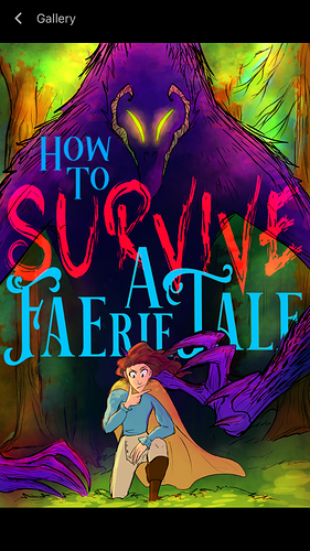
I really like this font and the idea you're going for, I just don't think you need to change so many elements of the font throughout--like when I was in graphic design classes, I would do these really illustrative and fancy font situations like you are, but I got in trouble for it, and my teacher once lectured me on how you should always avoid changing more than one element in your font because it makes it unclear what's a title and what's a subtitle, and what order to read everything.
So I keep reading this title out of order, because there are so many different sizes and colors, and the space where the creatures head is acts kind of like a gutter between columns of text. So, while it is visually real interesting, and I do like that, it's too much. I would reign it back. You got a really good thing going with the font and the color, just choose one, and knock off all the excess.
And as for stuff going in front of the title? I wouldn't' do it. This is going to be real, real small when you see it on Tapas, especially on a phone, and unlike a book cover where you can just hold it closer to your face, this is going to be rough to read. I'd just have the font cover everything.
But really, I like it, I think it looks cool.