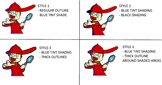
3 is the best compromise to me at first glance comparing the 5 styles, it's more readable, balanced and complete form of the style, also, not too contrasted as 2 and 5 almost hurt the eyes from numeric color strength / strong blacks vibration / vibrance.