This looks really cute! I'm interested in reading more!
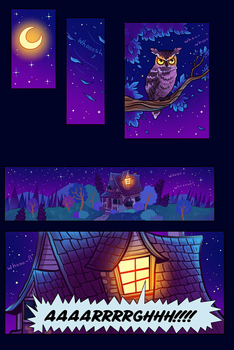
Overall, it looks really good! Only a few minor things I notice... the text might be a bit small, especially for mobile readers. "Oh the hydrangeas" is a bit difficult to read even on my large monitor.
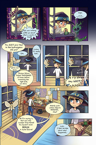
For the paneling, it also looks good overall. It's simple which I always feel is best, but the grid itself needs a bit of work. The edges aren't lining up exactly, they're all a bit off which makes it look more like a mistake than intentional, especially with the 3 middle panels on the second page.
On the second to last panel of the second page, it looks like the perspective of the background might be a bit too high up.
That moth is really great.