Mental health wards are usually colourful places, so I think it's appropriate TBH... I overall like the aesthetic of the comic, it reminds me of the feelings and atmosphere of the psyche ward I stayed at a lot, being very colourful and bright. Not all horror needs to be dark and gloomy, a lot of times awful things can happen in the light and daytime. It's more relatable that way IMO.
Finch, if I could give you any constructive critique, some of the backgrounds have improper perspective.
I've had this problem as well in my comic, and I think you should either learn proper perspective, use references, or learn a little bit of 3D modelling and simply trace them to do BGs. Of the two, I highly recommend just using 3D modelling, it's quicker and easier than you think. And unlike using 3D models for people which leaves this weird uncanny lifeless look to your figures, 3D backgrounds usually work out great cause walls and floors are already lifeless...
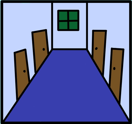
Especially in this panel, the top of the doors are all wrong... they should run pararel to each other.
Of course, take my advice with a grain of salt. Especially taking advice from me on backgrounds, cause a lot of times I don't ever bother with even 3D backgrounds in my comic and just half ass them using my instincts lol.
Just something to keep in mind I guess...

