5 / 5
Aug 2023

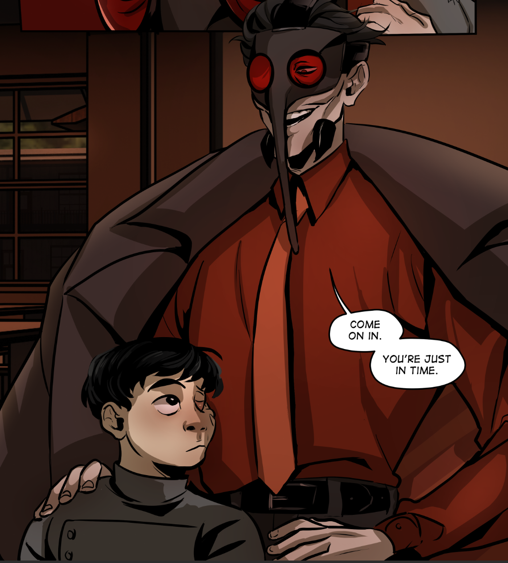
So, I've recently started working on editing my first volume. It's going to be a very slow process, but I work on it when I'm able to. This is mainly so that I have less extensive work ahead of myself for when I want to print.

I was thinking to myself "oh, volume one is extremely flawed, and I'll have to accept that the art is gonna look kinda bad. The fixes will just tweak a little." And that is still true, but now I'm seeing "oh, even just small tweaks make a big difference in how polished my work looks. I can honestly make this look really good."

It's weirdly given me a lot of optimism and confidence. Like the first couple episode's art was always decent enough to keep people reading, but I'm excited to publish the newer versions with even better looking stuff. And also fix up some of the inconsistencies in my work when I was experimenting and trying to see what works.

Also makes me less stressed out when a panel doesn't turn out exactly how I want it to with recent pages. I'm glad I'm able to more clearly see what needs fixing up now. I do absolutely plan on keeping the old version archived, I have fond memories of it and it's lovably janky to me. But I do want a nice, polished comic for my main posting platforms and print.
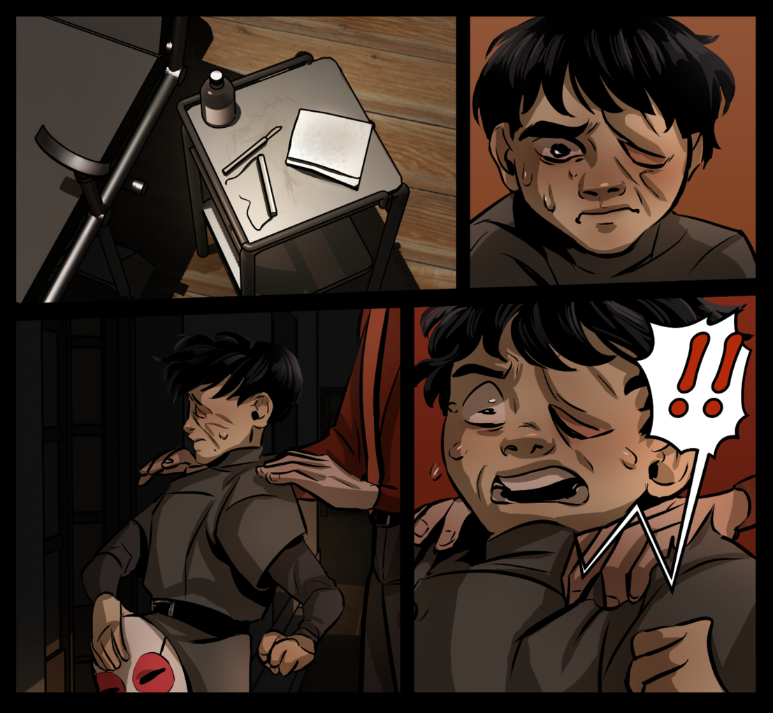
Old panel:

Edited panel:

Old:

New:

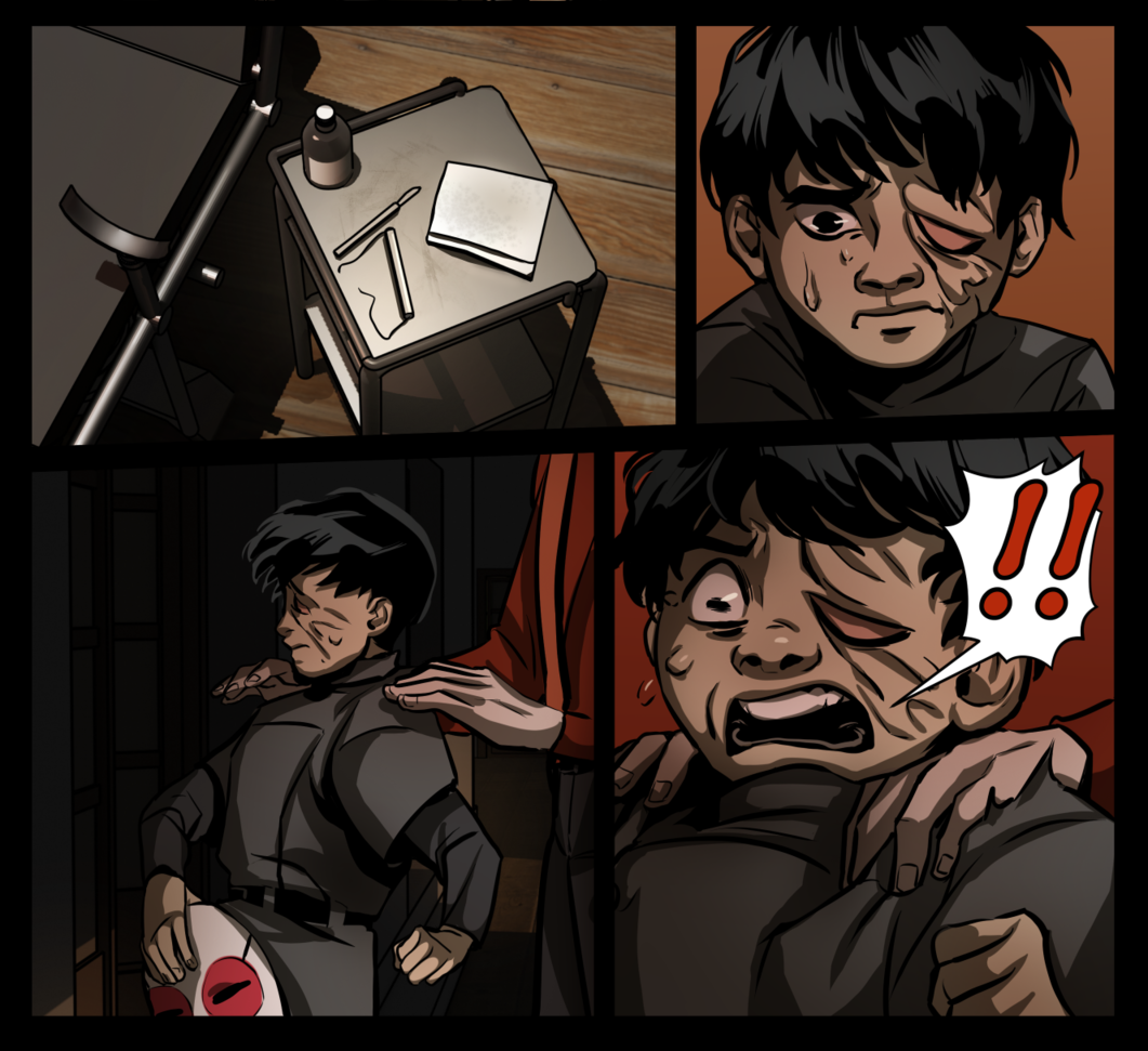
Tbh while there may not seem to be that big of a difference, I just know I'm happier with how it's looking and that feels great :coffee_love:

  • created

    Aug '23
  • last reply

    Aug '23
  • 4

    replies

  • 632

    views

  • 1

    user

  • 13

    likes

The old one looks more detailed to be honest, but both are okay if you ask me

I personnally prefer some of the older panels tbh...

Like panel 4 on your 2nd example you've sort of upped the contrast and textured more heavily on the skin burns but imo you've gone a bit too extreme with the texture contrast to the point it flattens the more general volume of the head so the skin abrasions seem deep while the face seems flat. You've done the same in panel 2 just above it but it works better there for some reason I can't quite put my finger on...

I do like how your work on the hair texturing is way more bold and confident though :smug_01: way more effective in the reworked versions.

Ooh, I see what you mean. One a past criticism I've gotten was that there wasn't enough contrast, but it seems I've gone in complete other direction at times :sip: it's not too hard of a fix for some panels I reckon, a good thing to catch onto early.

It's true there wasn't that much contrast in the original and sometimes lack of value contrast can be good, like if you're drawing a scene that's more gentle and emotionally tender, you don't really want a Caravaggio like level of contrast, it can be more telling to lower the value contrast and rely on colour contrast or warm/cold contrast instead to visually push the tone.

Also it's way better to take criticism then go too far in the other direction than to spend a lot of time making barely visible changes. You've been enthusiastically taking advice and that's really cool to see :smug_01: seeing as you obviously can dose it well on some panels it's just a question of always keeping in mind that you want the general volume of the object to be the first thing people see and then work texture into that volume. This can sometimes be a little harder depending on your method (I certainly find it difficult in cell shading but then again that's why I don't use cell shading in my comic xD).

In any case you're a champ for doing this and working so hard so keep up the good work! :hype_01: