Seems like you're off to a good start! I would focus on improving factors that will help your comic's legibility- most of my feedback revolves around that.
Font Size:
Much of the font in your comic is way way too small to read, easily at least. The number one thing that will turn someone off of a comic is if they have to strain their eyes to read it. I marked up an example here:
I would recommend not going any smaller than the sizes that are circled in green (although they could stand to be a little larger even so). The font circled in red is super itty bitty and difficult to read at a glance imo. It looks to me one part of the problem is trying to cram too much text in small panels, and the other part is that I would guess you typically draw the pictures first, and then try to fit the text in afterwards?
The panel size I'll get into in the next point, so for now I'll just offer a pro tip which is: try to locate the text in the beginning while you're first sketching out the panel  Here are a few examples from a comic i'm working on right now:
In this one I ended up shifting all of the text to the right and moved the characters to the left so that the word balloons won't cover anything important. I initially had some of the text on the left with the characters centered, but I discovered while laying it out that that squished the characters too tightly together so I rearranged it while sketching.
For this panel, I originally thought it would be more of a narrow, wide rectangle. But I ended up needing to make the panel taller and more square-shaped in order to get all of the dialogue not only to fit, but also to flow properly around the panel.
It's a win win because you'll end up with better page compositions and also text that's easier to read 
# of Panels & Hierarchy:
Ok here is where I'll talk about the panel size as mentioned above- I notice that your pages are loaded to the seams with panels. This isn't necessarily a bad thing (I think some European comics are known for having similar numbers of panels per page?), but the way they're being used here is hurting more than it helps I think, especially when it's driving the font size down.
One thing that can be used to figure out which panels should be larger or smaller is the concept of hierarchy; that some panels are more important than others and thus deserve more page real estate. Sometimes the biggest panels might be those that set the scene (establishing shots), sometimes they'll be those where a lot of dialogue is happening, or sometimes they'll be where something shocking or cool just happened and you really want to focus the reader's eye there. Right now almost every panel is in the kind of small-to-medium range, and so it gives the impression that none of the panels are inherently more important than the others. there are just like 8-15 small panels per page. Try to find those important moments and amplify them~ I did a quick 3 panel example from your comic:
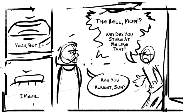
I felt like combining the first two panels into one gives it some oomph and can show both characters interacting in the same moment, and allows room for the text to be sizeable and comfy. Ending the row on the dramatic mouth close up gives momentum for the row to follow. This is the upper half of a page, if I were to keep going I would probably end at the door closing panel and then begin the next ones on their own page, personally.
Try to Mis-align your vertical gutters:
Last one for now, it's generally a comic no-no to have vertical gutters (the space between panels) that align. sometimes it happens and is unavoidable, or would complicate things further, but whenever possible it should be avoided. The reason being, it makes the reading order confusing at a glance. Usually you can figure out which way you're supposed to go, but again- the fewer times the reader has to stop to try and make heads or tails of something, the better
I noticed that... almost every, if not every page in this comic so far has this issue though 
For a visualization, the red circles are what I'm talking about (basically anywhere where a + of panel edges meeting occurs). The colored arrows are different possible reading directions, some more likely than others, but still:
Now I'm assuming that green is the intended path and it's not that hard to figure out, tbh. Buuuut you should still work on reducing those aligning gutters. Maybe once per chapter would be okay, but definitely not once per page xD This gets back into the hierarchy/size thing though- right now it's easy for this type of layout to occur because you're using tons of small rectangular panels per page. Once you start varying panel shape and size more, you'll be able to avoid this I think.  For example i might do something like this, idk how well the 3 panels on the 2nd row that I merged work together merged, but otherwise every intersection ont his page was eliminated with a few small stretches:
Basically T's instead of +'s in short xD
I think if you focus on improving those things the comic's readability will go up a lot as for the story, I think it's really interesting so far! Time manipulation powers have a lot of potential for exploration, and I also dig the force vector aspect shown off at the end of the most recent episode too!


