Okay, this was originally going to be just a quick redline to showcase a couple things, but it quickly turned into me brainstorming a thumbnail all on my own. I hope it's not a problem for me to do this; I really don't mean to draw your comic for you, I just do much better communicating with visual examples, so this was the best way I could come up with to communicate my advice.
So, 2 things that are working in tandem here. 1: in Comics, time and space (physical space on the page) are intrinsically linked, and 2: in comedy, timing is very important.
Thus, when it comes to making a comedic moment in a comic, panel size and placement plays a HUGE role in how funny your joke is.
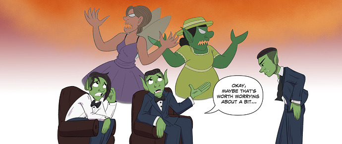
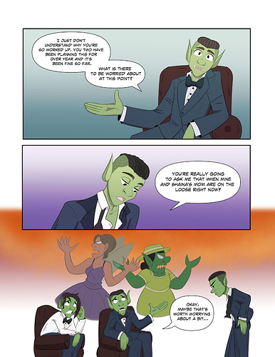
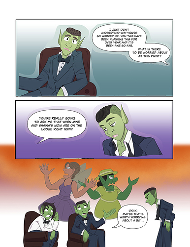
In your original setup, all three panels are roughly the same size, which subtly tells the reader that they take roughly the same amount of time. However, that third panel is supposed to be a sort of dramatic pause where the characters imagine the horrors of 'mothers on the loose'.
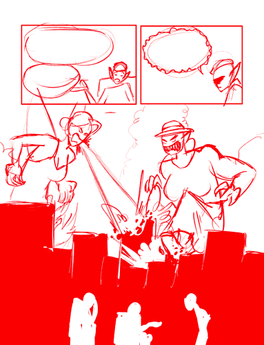
Just like there would be a pause in dialogue and movement, there should also be a 'pause' in the panels: make the reader take just that fraction of a second longer to observe the art itself, and it will come across as a moment of silence as the terror of their situation settles in.
I also shrunk the characters down and kept them more consistent with how they're placed in the scene; when I first read the page I legitimately thought it was the same guy saying both lines and it confused me. I don't know these characters so I don't know if they're supposed to look identical, but they're both the same race, both in the same outfit, and both have the same hairstyle. the only difference between them is the un-done tie and shirt button on one. Keeping them on the same side of the conversation (literally) throughout their exchange will make it harder for readers to mix them up.
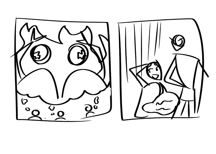
As far as the comedy goes, though, timing is probably the biggest factor, but additionally, exaggeration (or lack thereof) can be a big part of making comedy work. This being the case, go wild with the mother's designs. In your version they come across as ever-so-slightly monsterized versions of what I presume they normally look like, but we're in these character's heads, imagining what their mothers would look like with their FULL RAGE unleashed. Make them ACTUAL monsters, make them breathe fire and wreak havoc and look terrifying. Hell, maybe even switch up art styles and go for something more realistic with heavy shadows (maybe look up how good action/horror manga like Berserk handle drawing monsters for reference) to really sell the sudden tone shift.
I added a classic cityscape in silhouette so that I could
A: Have the mothers destroying something directly (to help emphasize their imagined power)
B: Give a sense of scale: it's hard to understand how big and scary the kids are imagining the mothers if we can't see how big they are in comparison to something else within said imagination, and
C: create a nice framing device for the characters at the bottom; having the city in silhouette means the characters having the conversation can pop forward really clearly, making it easier to communicate that the city-destroying kaiju versions of the moms in the background are just the kids' imaginations.
Like I said at the top, this is merely one suggestion. I don't by any means want to draw your comic for you or decide how you place your panels, This was just a good way for me to illustrate my thought process and how I would approach a scene like this to give you some ideas. Feel free to take this one directly if it vibes with you, but those core principles of timing and exaggeration are really the important things to get down. From there, the world's your oyster: there's TONS of ways to amp up this gag, I just went with one of them to illustrate which aspects can be amped up.