Something I heard a few people bring up is that they write a little better when they use fonts like comic sans in their word processors.
I think the idea is that the font is so silly looking and "non-threatening" that it helps you lighten up and get things out faster. I've always kinda liked how comic sans looked (its looks like my handwriting ) despite the hatred it gets for being too overused. But I'm so used to writing in times new roman that it feels a little weird. Any thoughts?
Comic sans reveals all. I've done it before. It really helps to catch those errors in your writing you might miss.
Yeah I tend to use typewriter style fonts to help me spot stray spelling errors. The looping letters are definitely easier to read.Fonts that are more tight tend to make it slower to read back, and that effects my writing speed.
I’ve used OpenDyslexie a few times to make things harder to skip over and that has worked well in the past.
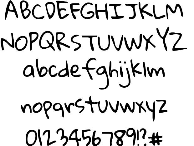
Just putting it out there. Tried writing with "Gloria Hallelujah" and it works great! It honestly does look a lot more like my handwriting than other fonts and the letters are so distinct looking next to each other that it makes finding mistakes a little easier. Font stuff works!