It's hard to do a proper art critique of a comic like this, because the style is so simple, fairly derivative and pretty low-effort; it's easy to literally copy-paste poses, props and assets as part of this kind of aesthetic, and the humour of this genre is rooted in how simple and low-energy the art is. I'll try my best though.
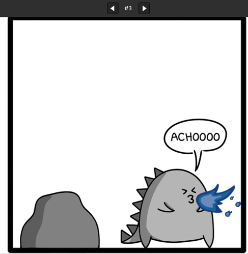
Okay so here's a panel and I'm going to go through all the things I'd suggest improving about it:
- Make the character stand inside the cell instead of on the frame of the cell. The panel border is a narrative construct, not a physical thing, so unless you're making a meta joke about the character being aware they're in a comic, never have them interact with a panel border as if it's physical.
- Also if you put characters IN the scene instead of all on the border, you could use the depth for jokes better. Like you could put that rock in the background, further back from Godzilla, then when he's hiding in the background you'd still be able to see.... uhhh okay I don't actually know who that's meant to be, Green Godzilla? as Godzilla hides behind a rock in the same panel, while he can blatantly be seen, which is funnier.
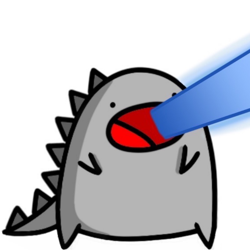
- The shadows all have a weird round edge to them at the tips that makes everything look soft and poorly defined. Also some shadows are placed wrong for the light direction, like the one above Godzilla's arm.
- The rock looks like a grey marshmallow. Look at some cartoon rocks for inspiration on how to make a rock look more rocky. Give it some definition and some kind of shape other than a blob.
- The fire is dark blue. Make it a nice punchy bright blue. Fire emits light, it should be bright looking.
- The spikes on Godzilla all being the same size looks kind of lazy and unpolished; they should probably get smaller as they go down his back.... but that's a character design thing more than anything.
- The speech bubble is weirdly scribbly for how mechanical the lines are on all the characters. It should probably be neat and clean like they are? It doesn't look deliberate so much as looking lazy.
If you're looking to really blitz on improvement, I'd recommend drawing something on the side that's more challenging and pushing yourself further from your comfort zone in a style where you can't reference established emoji-style expressions or copy-paste characters, but trying to get maximum polish on this comic is also a good exercise.