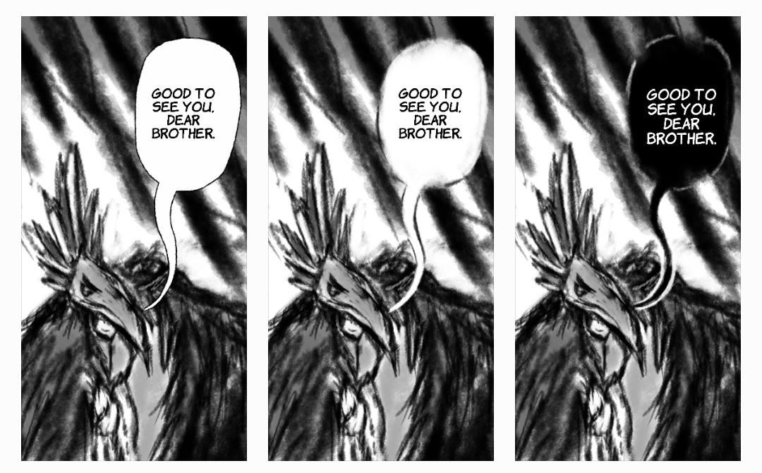
- 1 - Standard Bubble With Border
- 2 - Bubble Without Border
- 3 - Reversed Bubble Without Border (White Text on Black)
As the lettering stage looms for the first lot of my pages of my webcomic, Bird of Redwater, I've found myself a little stuck trying to decide what sort of speech bubbles to use!
I am pretty much equally comfortable drawing each type, but was wondering which one people preferred.
Here are the 3 -
Excuse the rather rough artwork! (And mobile squueish) I'm launching my webcomic soon so didn't really want to share the actual pages just yet  )
)
Standard is obviously the most readable, but it kinda wrecks the mood a bit? Whereas the other two blend in a lot more and allow incorporation of bubbles into the art much easier.
Personally, MY favourite is the white text on black but I'm concerned that could cause readability issues. Also think it could be a bit too much of a stylistic decision that might distract somewhat.
Love to hear what others have to say on this!


