Hello, thank you for taking the time to review my script. I just want to clear up what the concerns are.
Confused by the genre because of the shift in narrative/tone style
The setting isn’t established for these elements to fall in place leaving the audience guessing what kind of story this is.
Overall what I'm getting from this review is that characters aren’t established properly for you to get their personalities. The elements of the world feel off because I haven't established the mechanics of this universe and there is a drastic tone shift between act 1 and act 2 leaving the pacing feeling like everything is just happening but there is no explanation on why it is. Am I correct?
I don’t know if I’m correct but your review is very helpful in correcting my story, to be honest. Yeah, I feel I'm trying to fit too many elements together without telling too much. I think I already feel like I know what I need to cut and what I need to work on so thank you so much!
Now onto your review
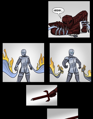
I think so far the narrative of the story is ok. It’s a little short so I can only judge on the three episodes. The first part seems a little confusing because it seems disconnected from episodes 2 and 3 but my guess is that somehow it’s connected later on to the story. I think the biggest issue with the story is the panel layout and composition of the panels. I think this is something people undervalue about comics but it’s so important because it helps pace the story overall and guide the viewer's eye. The first two episodes especially have this problem. What kinda format are you trying to go for, horizontal like a normal comic or vertical scroll like a webtoon because those two have different ways of visual storytelling. There are times when the fights don’t flow, there are too many panels, and my eyes are trying to figure out where to go. For example:
It could be read as two things
One of the fiery tentacles is latching onto the gladiator
Two fiery tentacles are releasing the gladiator.
We're kinda left guessing which one comes first.
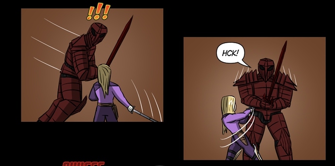
Now we go into composition which is similar to the panel layout but is more along the lines of the focus of the individual panel. Instead of putting a lot of panels to try to convey a scene trying to figure out how to condense that scene into one. For example:
Instead of her standing there, the dagger is thrown, and she dunks. It can be her talking and then in the next panel she'll look shocked because there is a dagger next to her (speed lines showing the dagger was just thrown).
I think your panel is also too small so they are surrounded by a wall of text which is visually unpleasant to look at.
The flow of action scenes is very off too. Sometimes characters make moves that don’t make sense.
So he’s coming to charge at her and stops as she cuts his side.
Example:
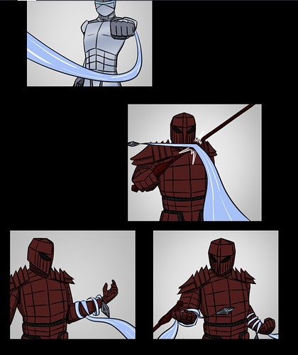
Also, some things are not shown on screen or the motion isn’t shown
example :
How did that turn around the arm
Example:
Why don’t we see the sword:
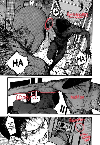
Action requires anticipation, motion, and reaction. For example, if I was to draw a fight scene where a robber slams a frying pan on a man’s head it would work like this.
1: robber and man are fighting
2: shows the robber looking for something as he gets beat
3: panels show he’s got a frying pan [anticipation]
4: slam! Frying pan hits the man [motion]
5: man falls to the ground while the robber gets back on his feet [reaction]
The cycle repeats
Now a reaction can also be put in between the anticipation and motion but these are just the building blocks for a fight scene.
It needs to be clear what the character is doing.
The perfect example of what I mean:
Episode 3 was a huge improvement. The story is now officially in a vertical format which makes it easier to see the flow of the comic but there are still things that need to be improved. Like the overcrowded word bubbles, too many small panels, and lack of variety with the panels themselves. I think you should experiment more with the format you're using. Remember it’s important to guide the viewer's eyes when reading a comic. If something in a scene is important for the viewer to notice, make it more obvious.
I used to watch this youtube channel about paneling comics. I think this would help
StripPanelNaked
Thank you so much for your time, good luck!