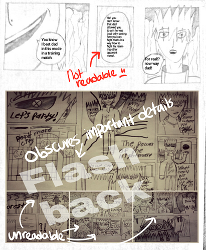
you need to make sure the pages look consistent, i dont know what program you use but gimp is a very nice free photoshop alternative and if youre mobile exclusive then scanning apps like scannable should work fine. you should ink your comics and then be able to adjust colors in them. as is the gray pencil takes away focus.
panel effects are important but some of the images look like theyve been deep fried :'v instead of using the sharpen tool (which is what it looks like) you can create contrast through filling in color, which if youre doing traditionally, can be done with watercolors (use thicker paper though) or markers (alcohol based ones like prismacolors or copics are the best).
black and white with a singular bright color can really make things pop
i'd take a look at the elements and principles of design to see what you could do because they do help to keep in mind (resource 2) (3)
also, make sure pages and text are readable, sometimes it's too compressed or small to read. you should keep text within 2-3 points as a size range and save as high quality jpg or png
i hope this isnt too harsh!! its good that you're doing something like a comic because it'll help you to improve a lot! its good that youre already doing backgrounds and establishing shots because i avoided it at first.