When I'm working with flat colours the important decisions are:
- What's the darkest possible colour I'm using. I only use pure black for inking, so if a character is wearing black clothing, the "black" fabric is usually a dark greyish blue or purple. Because black clothing rarely looks pure black; the fabric still reflects light, it's just dyed as dark as they can make it.
- What's my approximate level of saturation and value overall? Do I want really bright colours or a subdued, muted feel? And do I want light colours for a soft, floaty feel? Dark colours for a dark and grungy feel? Or something in-between? The main thing is avoiding too much or too little contrast and to have a fairly consistent level of contrast.
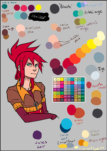
So the original palette for Errant, before I made the better organised one looked like this, complete with weird Rekki with her old colourscheme and drawn in the style of the early pages  :
:
So the basis/inspiration for this palette is that square in the middle, which is a chart I found online of the colours that were available to pre-digital colour comics. I love the bright, lurid colours of 1970s and 80s American comics, and this is a bold action comic with chunky inks. This formed the foundation for the rough level of value and saturation.
That run of red-yellow on the right is me working out how I'll bridge the gaps between the hues on the chart and flesh things out. I tend to use "hue ramping" in my colours, which means that as colours get darker in shadows, they move towards blue or purple, except skintones and yellows, which move towards red. This is a shortcut for approximating the blue scattered light you tend to get in shadows IRL and the translucency of skin which means you get a reddish look in shadows on it (because some light is still going through the skin and blood and visible in the shadowed parts of skin, this is called "sub surface scattering"). Other than that, I have a "white" which is actually a very light grey-blue for eyes and teeth so they don't look weird with the overall palette's brightness level.
Having the test Rekki there was important to just check that my light colours, darker colours and skintones felt cohesive. I definitely recommend testing out the palette you put together on an image with the pipeline you want. Also never be scared to make alterations on the fly. I tested a lot of colours for Sarin's hair before I hit a shade of blue that didn't look horrible, because as soon as I filled the original blue in a panel I went "EUGH!". Blue and Green can be two of the hardest colours to use well, because computers can create incredibly bright blues and indigos that look very unnatural, and green is always hard because humans can perceive more shades of green than any other colour, so I'm always extra careful with those. They usually need to be less saturated than the warm colours, and greens I try to avoid emerald green in favour of spring greens or teals.
I put a LOT of thought into my colours, some people might think I go a bit overboard, but I do get complimented on them pretty often, so I feel like it's worth it!