If you want cohesive, you could try:
-Monochrome (as in, everything is lighter/darker shades of one color)
-Tinting all the colors towards one main color (so if you have a beige wall, all the other colors in the scene are just a smidge away from neutrals that would match: brownish-red, dull green, deep navy blue, etc.)
-Limited color palette (you have only one shade of green, red, blue, etc; and you use that same shade everywhere throughout the comic. Shading is usually hatched, black/white cel, or nonexistent)
If you want pleasing to the eye...actually, there are a ton of ways to do that, including the above. ^^; But just for the heck of it:
-Temperature Control (use only cool colors, or only warm colors. If you do include colors from the other side of the wheel, make 'em weird (for instance, bright cyan in a sea of warm reds, or pale pink in an ocean of blues))
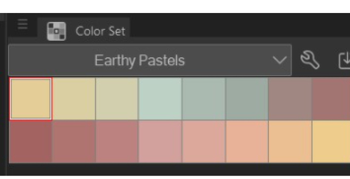
-Pastels (Using light, baby color schemes is practically a cheat; they tend to look good no matter what. For maximum effect, try to either limit the color palette, or go full impressionist with tons of different shades.)
-Background disparity (limit or monochromize the background, while keeping characters and foreground elements in full color. For extra cohesiveness, tint the characters similarly to the background.)