You wanna be popular? Hang on, lemme put on the only proper music...
Okay, let's do this. First thing, let's look at your first impression....
Your cover would benefit from a few changes:
1. Make the text pop from the image more. Avoid handwritten text because it looks amateurish, and make it a brighter colour like a bright gold or white so it stands out from the things behind it.
2. The character and the wall behind him are too close in saturation/value. Try making the wall duller so the character pops out more.
3. If you redo your cover art, consider cropping in closer to the character and a more dynamic composition that uses diagonals so there's less blank space and it looks less planted and static. Here's a good tutorial on composition.
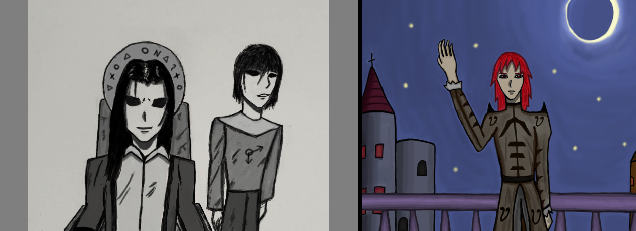
The banner is two images, one black and white, and the other colour. Make it one colour image that fills the whole space to it looks more finished, designed and polished. If you don't know how to do that, put some time into learning and getting better at whatever image editing app you use by searching tutorials.
Now onto the comic itself...
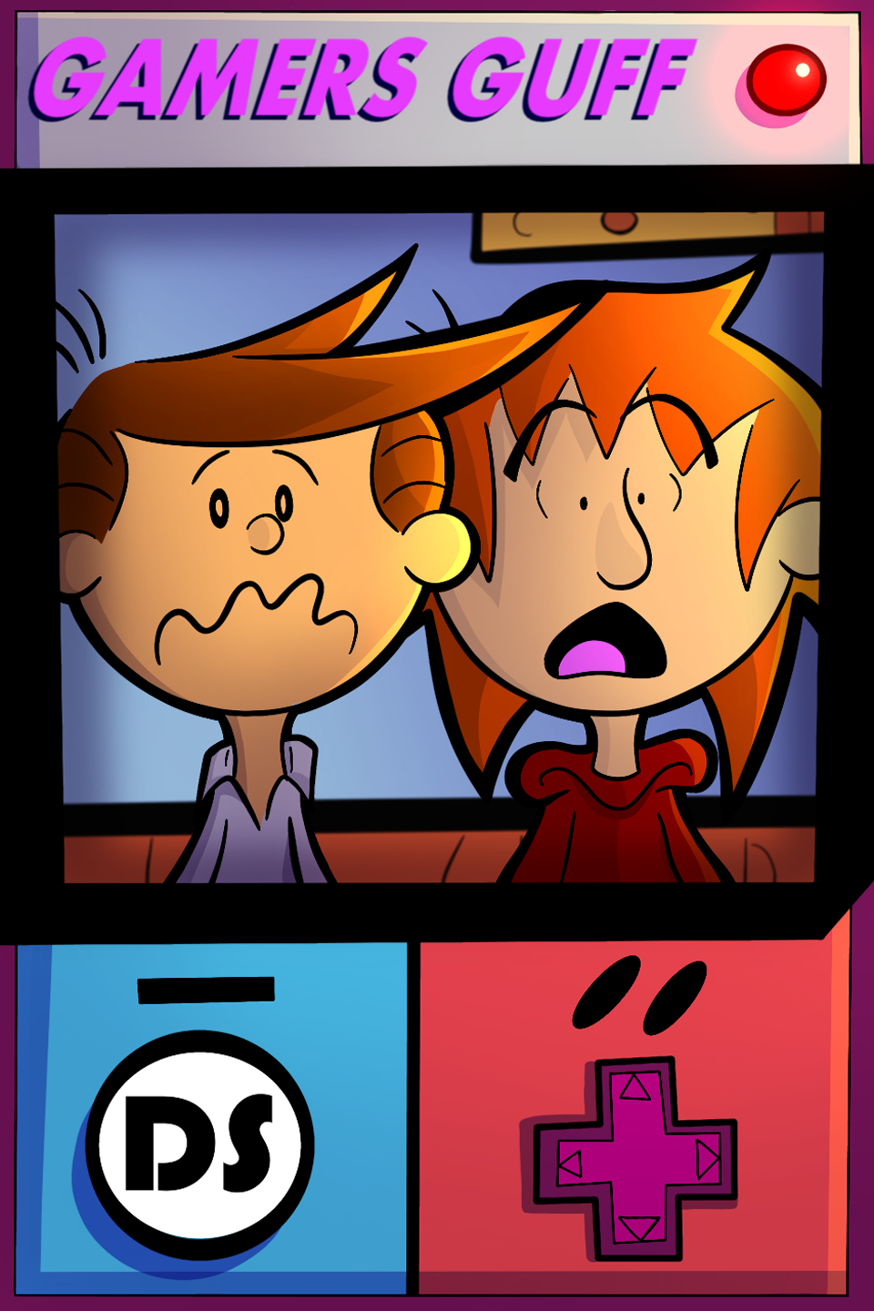
You're not using the Tapas format and the space if gives you effectively. Make sure your pages for Tapas are always 940 pixels wide so you use the full space, it'll make your comic look way better on the platform and easier to read on mobile (where most of the readers are).
The pages tend to look muddy due to a lot of similar levels of value (brightness) and saturation of colours on characters and backgrounds. Make backgrounds more muted and either brighter or darker than characters so the characters stand out, it'll make them pop and make things look better.
Handwritten text is really hard to do without looking amateurish or unpolished. I highly recommend heading over to Blambot.com and browsing the dialogue fonts section for a free dialogue font you like. Anime Ace and Digital Strip are popular options.
You might also want to consider learning to make speechbubbles using shapes in your image editing app of choice. It makes things look better presented, again improving the impression your comic makes.
Put gutters between your panels. Lines are okay, but white space between panels and having panels with a black stroke around can add a bit of extra presentational flourish.
Hopefully making these changes will make your comic look more polished and attract more readers.