Maybe there is in the discord, but nope there is none in the forums as far as I can tell
Yeah, there's one on the discord, but it's honestly hit or miss depending on who's online. The forums is a much better place to place a more focused review by creating a new tread.
Alrighty, I'll ignore the speech bubbles on here (unless you really want critique on them). Let's get right to it shall we?
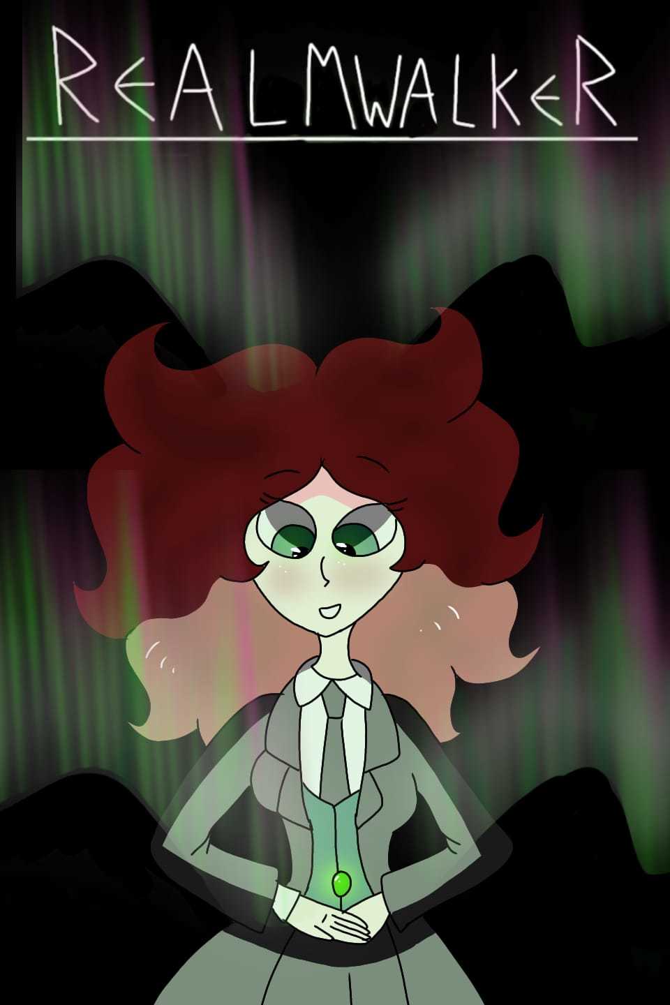
I feel that the special effects, while colorful and clear enough, look rather wonky. Especially the laser on the top left. It doesn't look like the sparks of the ray match the point of impact. If that makes sense.
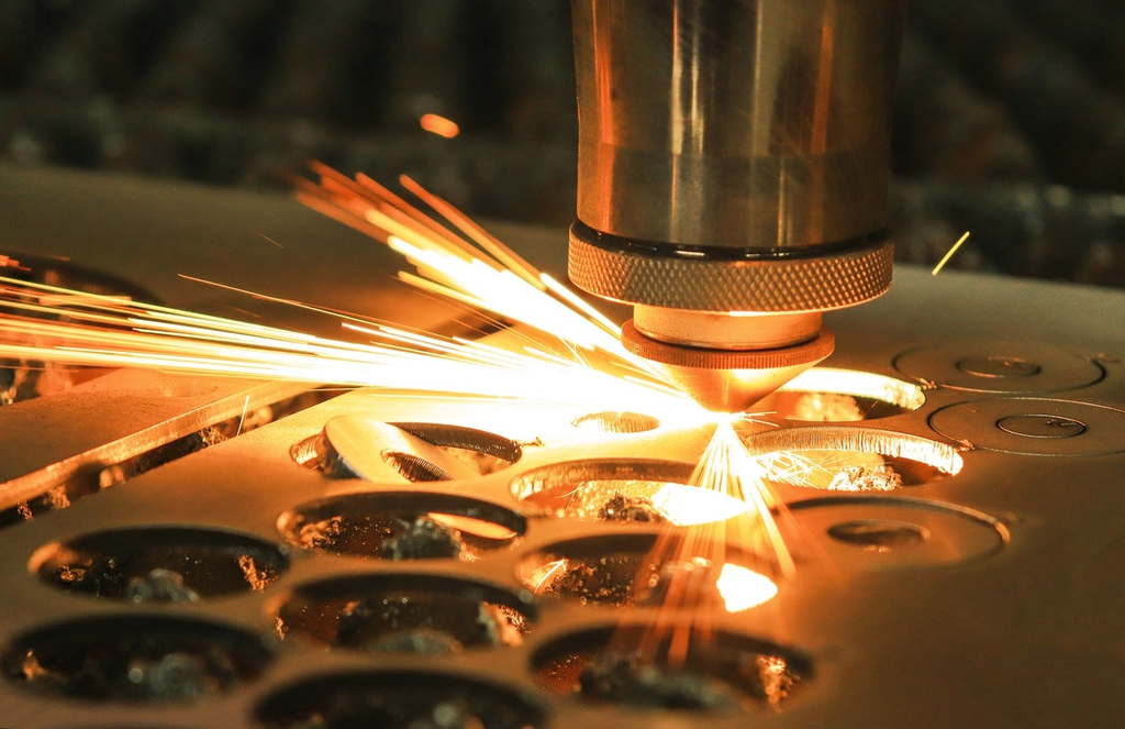
Here is a real life example of laser cutting. It's not a ray firing but you can still see the sparks match the point of impact. You can also see that the sparks are straight and not bent. This is because it's debree/material shooting away at high speed. So the trajectory of the material is straight due to its velocity.
You can apply that to the mining of the rock in your cover. Right now it looks like it is spilling ooze on it, but if you do something more like the example here it could really up the intensity of the mining process
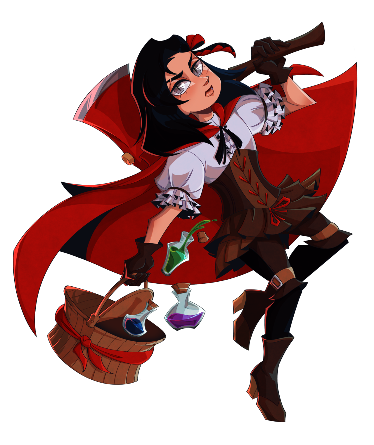
Honestly looks really polished. Something was bothering me though, so I decided to check and turn the saturation all the way down.
I think (and this is mostly a gripe from me) that the contrast in some places could be better. My biggest example would be the contrast between the hair and the axe handle on the right, which even with the colour image I had a hard time telling apart at first. Some parts have better contrast like the skin and white clothing parts, but there are a lot of darker elements that can be a bit hard to tell apart from each other without zooming in.
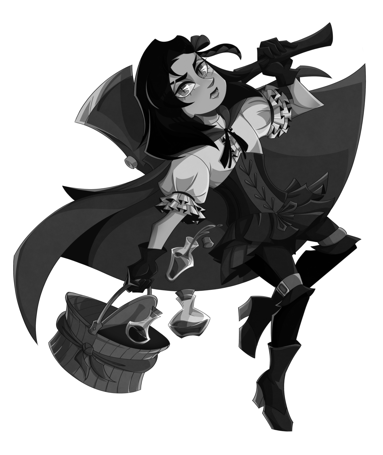
I don't have anything improvement worthy of the rest, it looks fantastic and your style is very fleshed out. My recommendation is to check for the contrast like I mentioned and see if there are values that can be optimized.


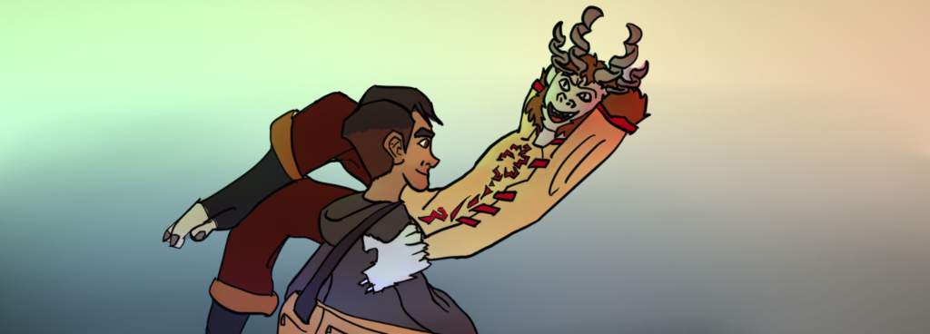
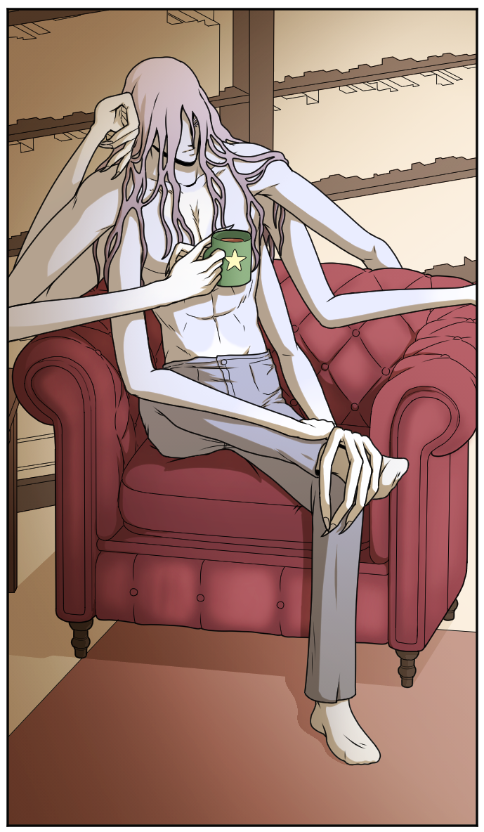
I'm down! Is it cool if I share a panel? Mostly because this character has been pretty difficult for me to draw given the arms and I really want the anatomy to feel believable without destroying the aesthetic of the form, if that makes sense. He's based loosely on Vishnu from Hindu mythology.
For the bg I've been trying to find a balance between detailing and too much. I didn't want to put a lot into the bookshelf behind him because I didn't want to take away from the focus of the character, but I'm still on the fence about that sort of look.
Panels are cool! I just don't feel like constantly openings links, it's handier to keep everything inside the thread
I get that. You probably don't want this to turn into a promo drop thread, either. Lord knows we have enough of those, lol.
Thanks for the compliments, you're right about the low contrast though  . I do think it works to draw attention to her face and arms, but overall it is on the darker side.
Hmmm for yours I'll focus on the lineart. I know you have most likely heard a lot about anatomy and perspective already so not gonna nag on you for that.
You can however, do more with your linework. Right now it is very simple, all the lines have the same thickness and it doesn't pop too much. But look at the examples here:
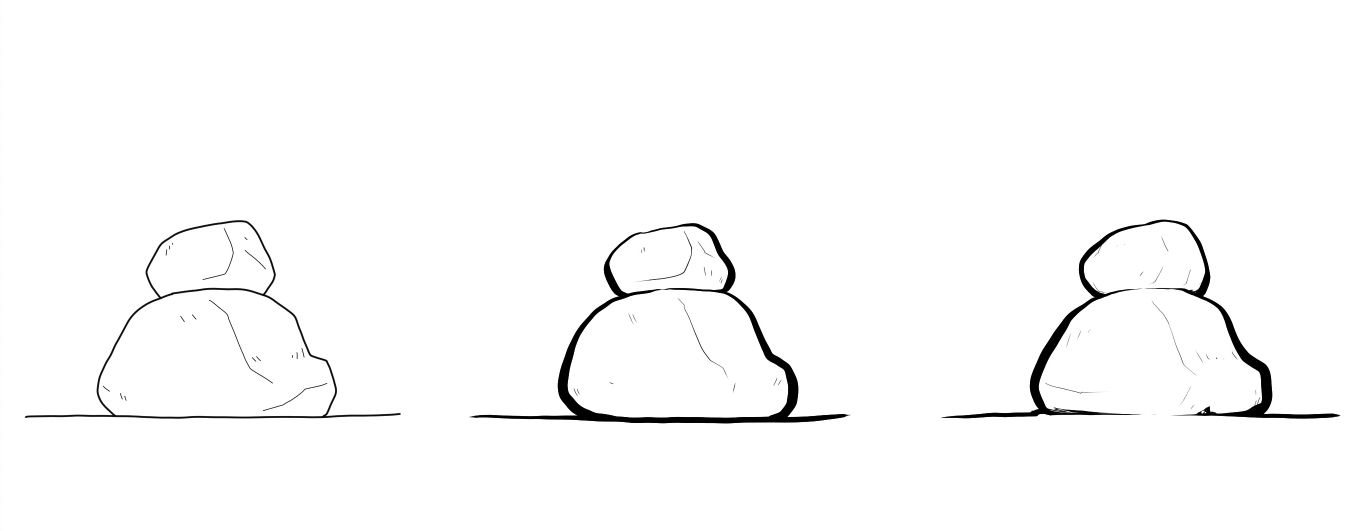
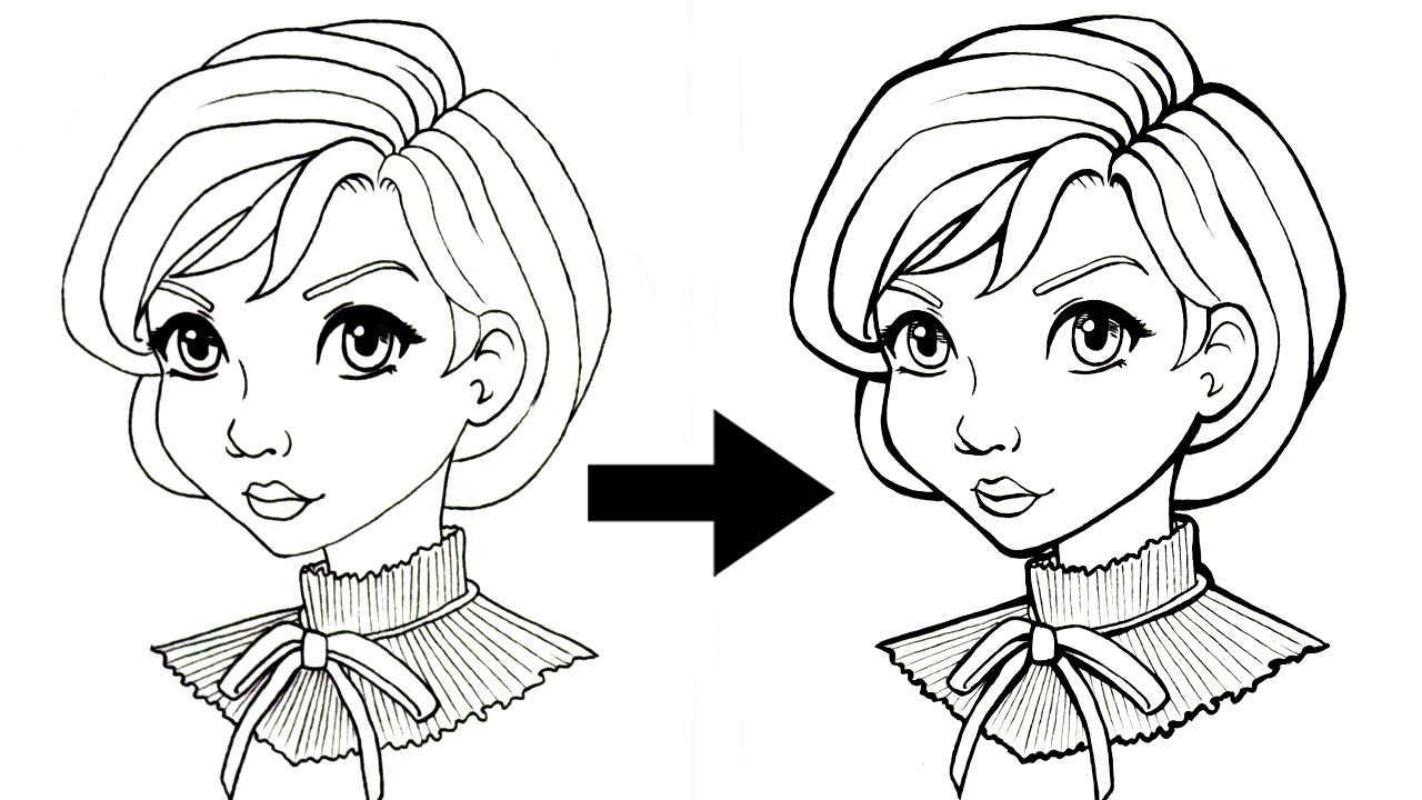
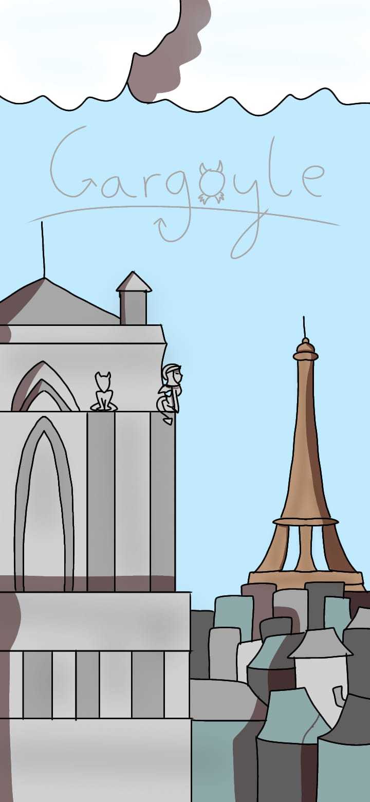
I plucked these from the web and they are relatively simple changes, but look how it changes the illustration! It allows you to leave smaller lines for the finer details while drawing attention to the general drawing with bolder lines. I think this is especially handy for your Gargoyle cover. If you use bolder lines for the closer building you can really whip up the illusion it is closer than the faraway buildings.
Can I ask what program you use? Cause Clip Studio has the vector layer which can allow you to change the line weight of your vectors
Hmmm I'm mostly having trouble making sense of where the arms connect. Like on the left side (from my pov) it seems to be the one shoulder on top and then the other two sprout from beneath that one, like a pyramid if that makes sense. But with the other one I'm not so sure. But maybe that's the hair covering up some areas and it looks fine for the most part.
The books however are a bit jarring. It feels like you drew (or pasted in) the books and then erased the lines in front while some of the upper lines remain.
If you are afraid the books will take away the focus (or any background detail for that matter), you could make the contrast high, like having a dark bookshelf will contrast a lot with his lighter body and hair. That could really make him stand out. I'd say play around with the value of the books. But personally I'd keep in some of the front lines of the books atleast. It adds more texture to the background that it feels like it's missing right now (in my opinion).
That's fair, I appreciate it.
Yeah, I actually drew out the individual books initially as a sort of base sketch, then for the actual background lines I just did the outline of 'em to reduce detail. But having the darker contrast might help, thanks!