Ooh, I think I can help with this! I ended up making my comic in a super exaggerated style, and am in general a huge fan of this kind of artistic approach. 
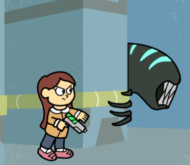
How necessary the foreshortening is for simplified and exaggerated character style and background? It's just as necessary for storytelling purposes (since we still tell stories the same way), but the super-stylized art tends to dull the efficacy of foreshortening. You have to couple it with extreme deformation/exaggeration to get the same point across. Like, with a realistic character, you can just have them point at the camera and that is dramatic enough, but with a cartoon you really have to push your shapes and line of action to give it the same "level" of drama.
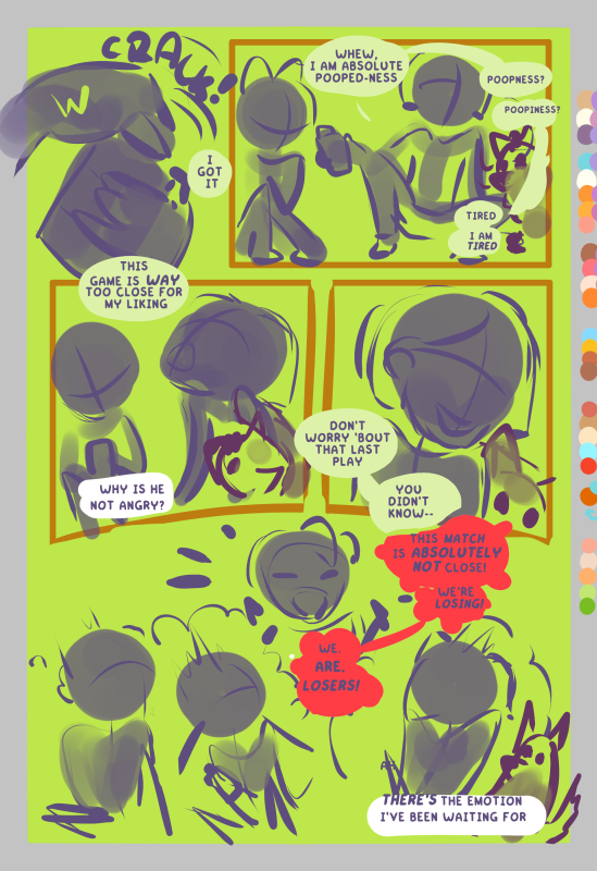
In comics (or sometimes animations) with such style, do we draw full body of the characters all the time? Check your page composition for this. In general, you want to create visual variety regardless of style, but it also doesn't quite read the same when your character's head takes up a third of their screen presence at all times. 
I usually do something like this to check my "visual balance" in a page:
Do the others use more dynamic gesture? And any tips for practicing of using gestures and simple shapes, especially when designing characters? Yes. This is what makes or breaks people's immersion in your story. The reason WHY cartoon style exists is to allow you to do things that aren't possible for a human body to express a feeling or emotion. Otherwise, you're just handicapping yourself for no reason! A realistic body is SO MUCH BETTER SUITED for subtle things.
I wouldn't say you should design your character around gestures, necessarily, since those are heavily contextual. But it's a good idea to keep the end goal in mind. For character design, you mostly want to think about shapes.
Like, at her base, this is Dot:
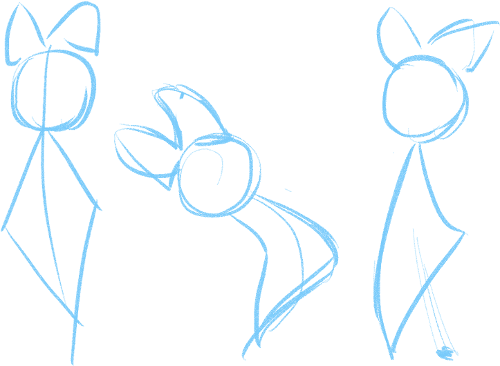
She is primarily dictated by the center line of action, but there are a few elements in her design - namely, her huge hair bow - that can contradict or enhance the line of action as she moves and emotes. Ideally, all of your important characters have their own, easily-recognizable shapes. There's not that many of them, so at some point in time, character design becomes a process of elimination 
ETA: For practicing gesture, nothing is better than life drawing gesture studies. Try and learn to see which lines dictate how you "read" a pose, and practice exaggerating them to get the point across.
Especially when drawing children, I don't like making their head so large, that they barely touch their top of their head. The Art of Up (by Pixar) actually gave me an explanation of how to deal with this: just cheat. No one will actually notice if your character's arms are suddenly long enough to reach the top of their head. Cartoons are malleable! : P
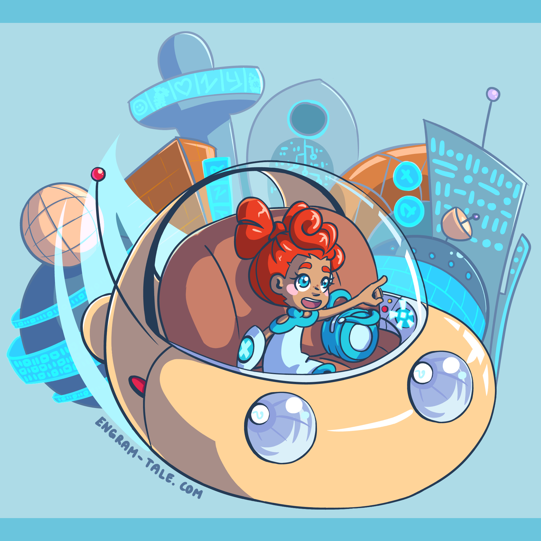
How others simplify machines, vehicles, and robots? Here, we go to a known principle in graphic design: lean into your strengths, and away from your weaknesses (within reason, of course - this isn't an excuse to not learn to draw things, more like... why contort yourself to doing something one way, when you can already do it better with a different approach?). Like if you are really good in terms of thinking in one shape, but not in another, see if you can design all of your designs with those shapes instead. For example, I'm generally pretty TERRIBLE at designing square-shaped or sleek machinery, so I... don't. All of my robots and vehicles are built from circles and rounded edges, because it's easier for me to think this way. It looks intentional and cohesive and maybe even a little unique. No reason to change what works!
For studying other people's styles.... just see what they do in terms of shape, gesture and color (you can even trace over to find the shapes, or sample the colors with an eyedropper to compare). Generally those are the three most important facets of communication in super stylized art.