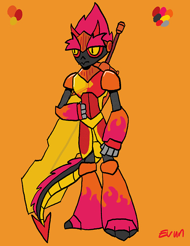
I think the yellow is actually a good idea as it calms the whole design down a bit because I find it very busy with the pink. I also recommend watching a few tutorials that deal with character design on youtube, I found them very helpful. Here are some that I consider quite good/eye-opening:
1 2 3
I also would say to take just 1-2 focal points in the design that kind of lead the eye. Think about what is the most important feature in your design and built it from there. If you want the sword to stand out more, give it more attention by giving the rest less instead of randomly adding details that compete again with the rest.
It might also help to have a more neutral background as your character is already very bright, with the orange I personally find it a bit difficult to see what belongs to the character and what is background. It's also easier on the eye.