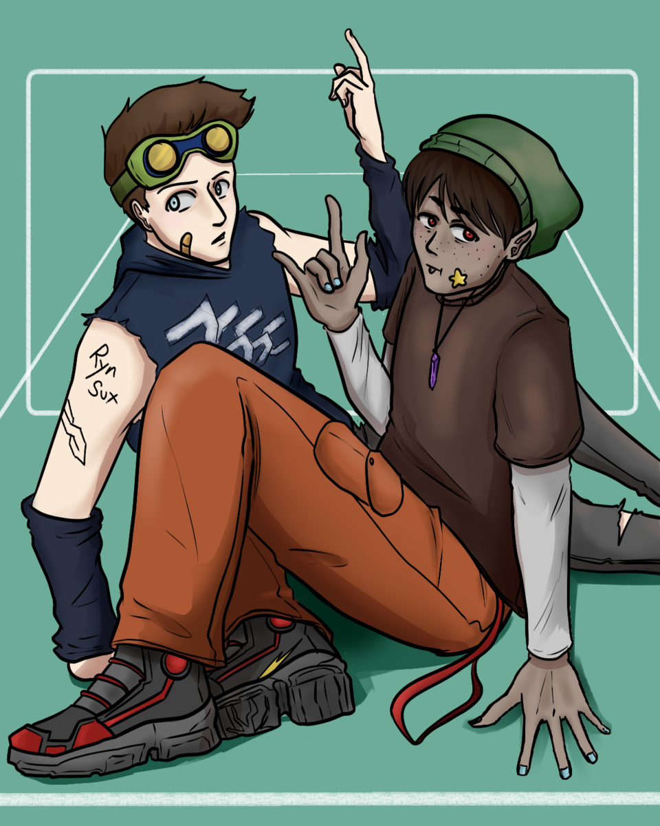
Ohhhh...yeah, I don't think I picked up on that at all. Oop. ^^;
Well, a lot of what I said still works in that case, but I feel like I could add a few more general tips:
So it helps to get reference pics for fashion subcultures if you want to use them; so you can understand their general look. The construction of those outfits works for a 'skater boi', but the colors are a little too loud to give off the correct impression. Tbh, the neon details in particular feel more like a 'punk' element-- not that you can't mix styles, but I'm focusing on one thing at a time here. ^^;
So Google Images is giving me this:
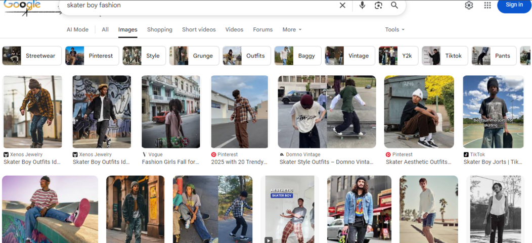
Which is about what I expected. Casual boys' clothes (hoodies, T-shirts, denim jackets, jeans, sneakers, etc. etc.) in muted colors, yes...but muted in a specific way. This is getting into fashion/character design more than color theory alone, but hear me out:
So contemporary casual clothes usually have a color scheme with a focus on neutrals-- the biggest portions of color (i.e. most of the pants and/or most of the shirts...like, at least half the body) will be browns, blacks, greys, whites, and navies (jeans), with brighter colors used as accents/accessories.
You kinda need those proportions in order for an outfit to read as 'casual', especially in the gritty/urban way evoked by the 'skater boy'.
So really the biggest issue with the outfits you designed isn't the colors themselves; it's the proportions. ^^; Swap them around in a more casual direction, and you could easily kill two birds with one stone.
However, the colors themselves could still use some work-- they are muted, but they could be a lot more muted, especially in a 'boyish' direction that puts extra emphasis on strong-yet-desaturated hues.
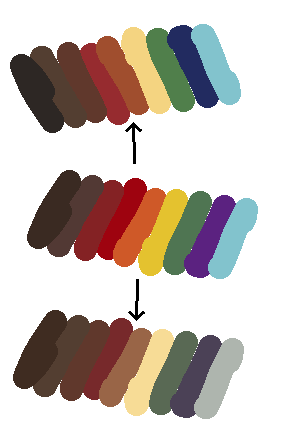
The original color scheme is in the center, with two potential 'casual corrections' on the top and bottom.